← Home ← Back to /v/

Thread 720271845

15 posts 18 images /v/
Anonymous No.720271845 >>720273519 >>720276768
Star Ocean
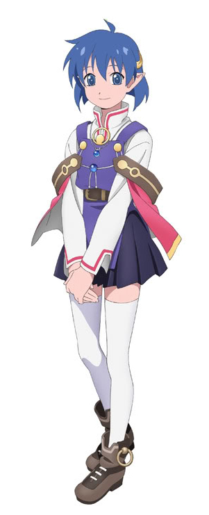
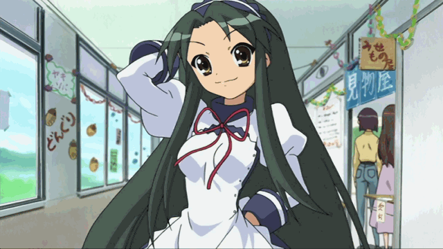
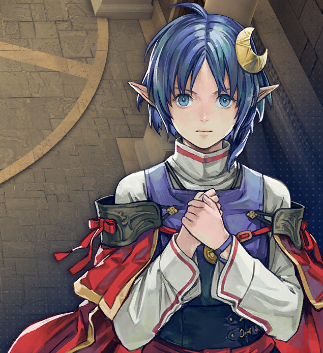
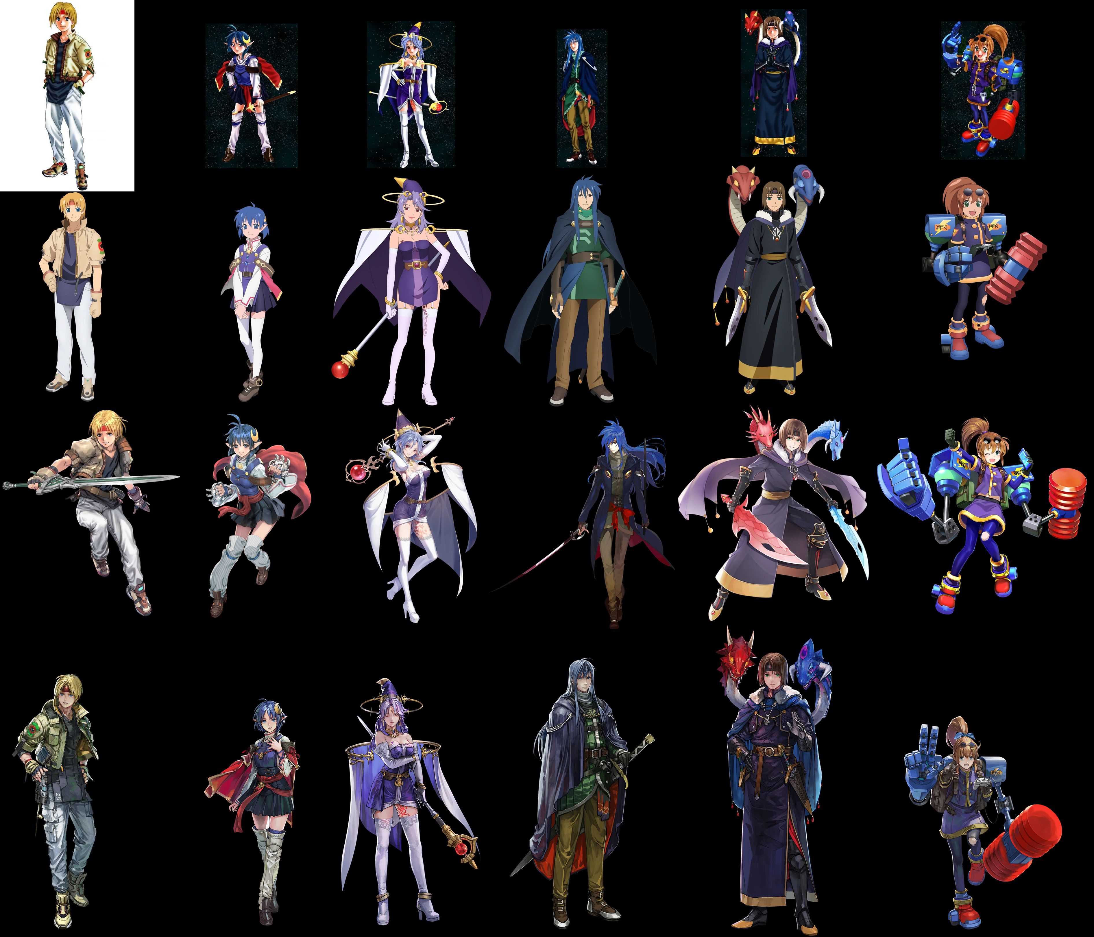
I like the moe art style of the PSP version the best, and I think the haters are just old people that prefer the 90s anime look of the PS1 version. Both art styles are like time capsules for the era of anime art they were released in.
The PSP art also has the distinct quality of appearing like TV anime design sheet art, rather than the more detailed art you usually see for game portraits.
Anonymous No.720272119
Anonymous No.720272129 >>720272524 >>720273519 >>720275026
moe shitterfication of art is always bad lets be real
Anonymous No.720272463
It doesn't offend me like it does some people, but I understand why it does.
It makes everyone, especially rena, look like damn children when she is an adult, and the game wasn't designed around the overly cute moe style.
The modern remake does a good job of punching up everyone's portraits and voices without trying to turn star ocean into lucky star.
Anonymous No.720272524
>>720272129
This is a case where they drastically changed the art style of the franchise from a detailed, painterly look, to this. Dawn of Sorrow doesnโ€™t have bad art, but itโ€™s weird that a Castlevania game looks like that.
Star Ocean 2 arguably had a moe artstyle to begin with. Just a 90s version. What a lot of people think of as moe is only a particular section of its evolutionary chain. Whatโ€™s seen in Second Evolution for example has more of the qualities of 2010s moe creeping in as the turn of the decade drew closer. If it were released in the early to mid 2000s instead, Renaโ€™s eyes may have been further apart, and her head wider in general.
Anonymous No.720272898 >>720273050 >>720277121
The problem isn't "moe" - the problem is that it looks like a cheap TV anime. TV anime tend to lack the details and shading that you can get from an individual artwork, but it's fine because anime is animated. Portraits usually aren't animated beyond maybe eyes and mouth, so there's no reason for it to look this cheap.
On a side note, they just announced physical copies of SO1.
Anonymous No.720273050
>>720272898
See, I like that TV anime look. I understand why itโ€™s drawn that way for anime, and how itโ€™s odd to use the style for a game, but having watched so much anime I just like how it looks. Playing SE on my PSP as a kid I think โ€œoh, this actually just looks like itโ€™s from an anime. Cool.โ€
Anonymous No.720273519
>>720271845 (OP)
>>720272129
They were trying to cash in on the rise of moe anime in the late 00's.
Anonymous No.720273551
>Generic moeshit artstyle
>Good
Anonymous No.720275026
>>720272129
>moe
wtf are you talking about
Anonymous No.720276576
I think the PSP art is bad both technically as well as in reflecting the character's age and personalities
Anonymous No.720276725
Rena as toddler in the new art has very similar proportions to the PSP's young adult portrait
Anonymous No.720276768
>>720271845 (OP)
Looks like cheap anime
Anonymous No.720277121
>>720272898
>they just announced physical copies of SO1.
Oh, gre-
>LRG
Goddammit.
Anonymous No.720279216
>Remake 20+ years later
>Actually improves the art