>>58012506
Okay, I'll give it my best shot.
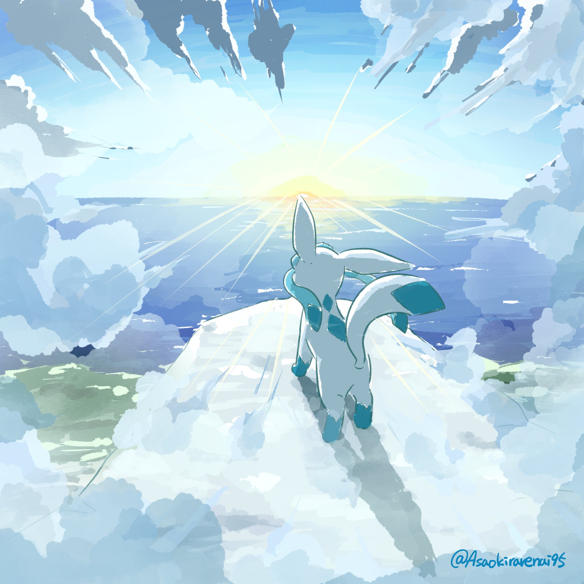
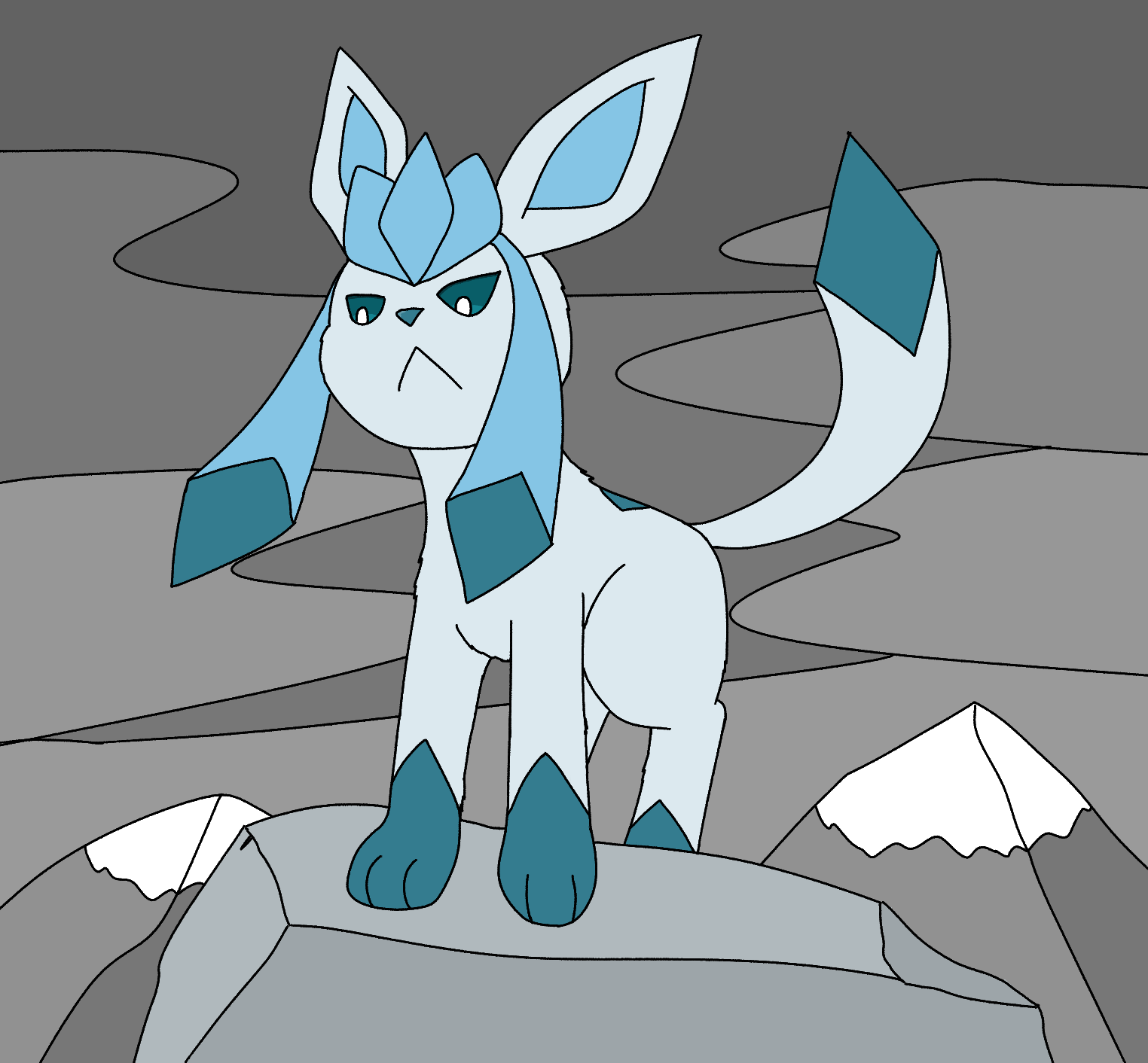
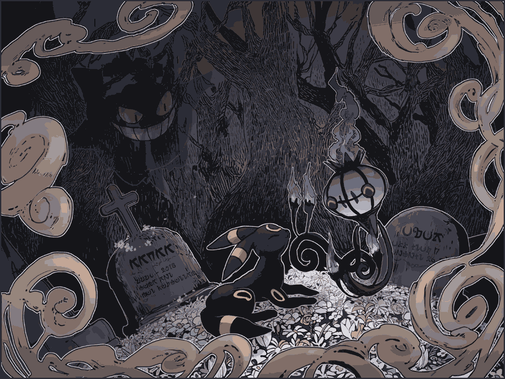
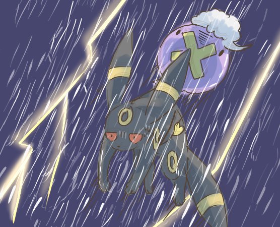
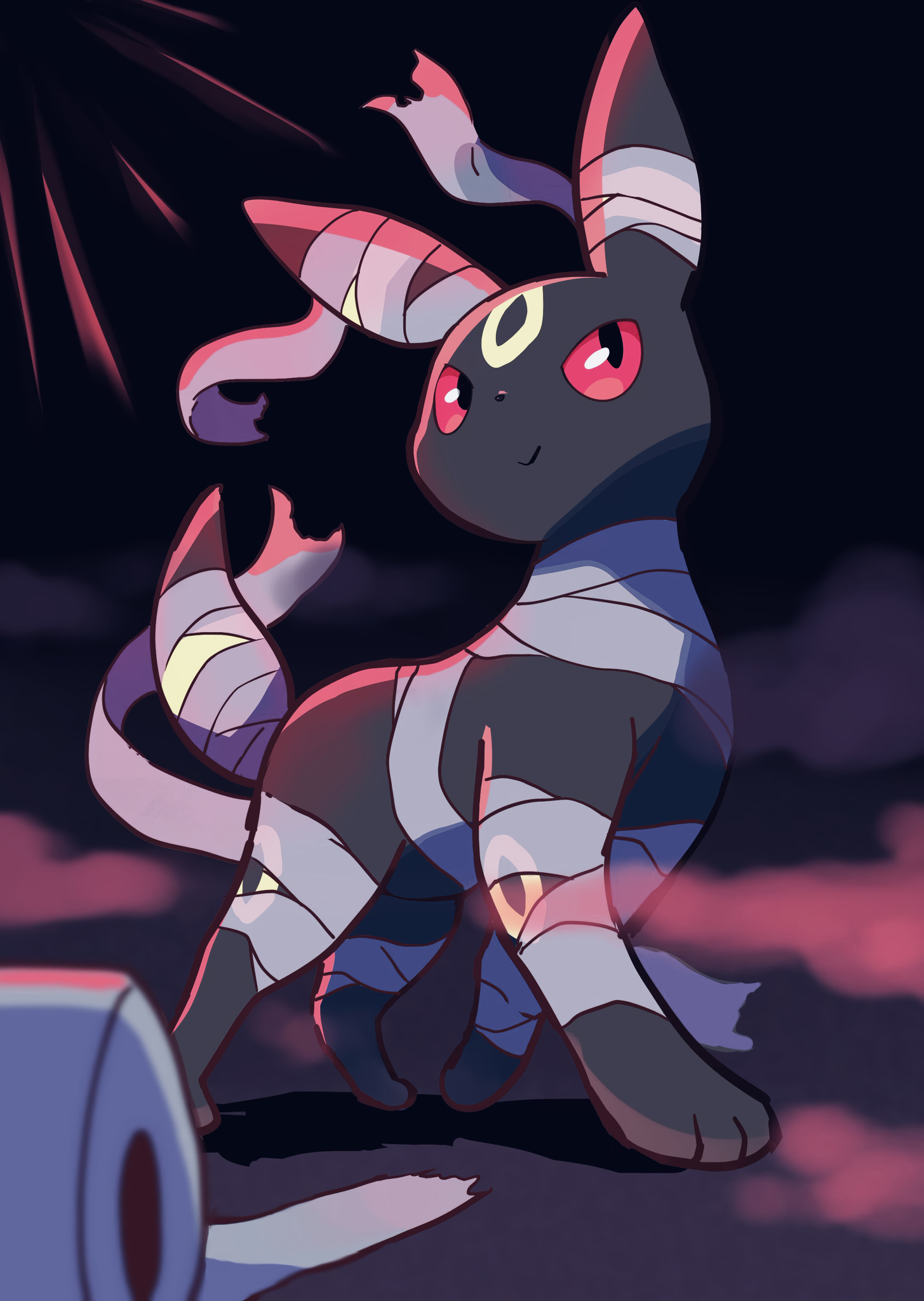
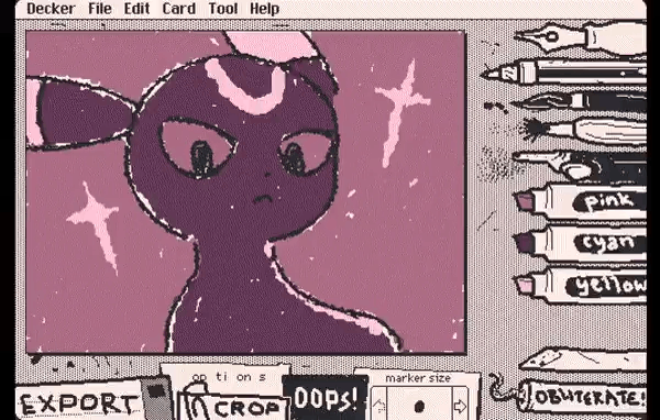
>Lines
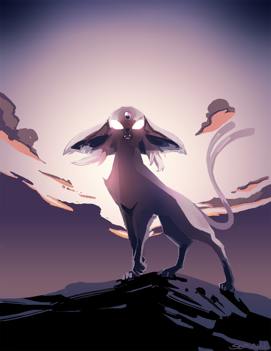
Every line in your piece has been drawn with the same "importance", which added an awkward "flatness" to the whole image. You can improve this in a few ways: Varying line thickness (the more distant/less important the object, the thinner the line), giving the lines different colors (distant/less important objects have less striking/contrasting line colors) and simply leaving the background mostly lineless and defined by shapes instead (only adding lines where necessary to accentuate the shapes).
Be careful with Visual Tangents, too. That's where two lines or shapes touch or get too close together without a clear overlap, which can kill the "depth" of your image.
>Coloring
You used a lot of gray there, which is a neutral color and hard to make it look "natural" by itself. But the solution is simple; just blend in some blue and/or purple. I think that alone would improve the background a lot.
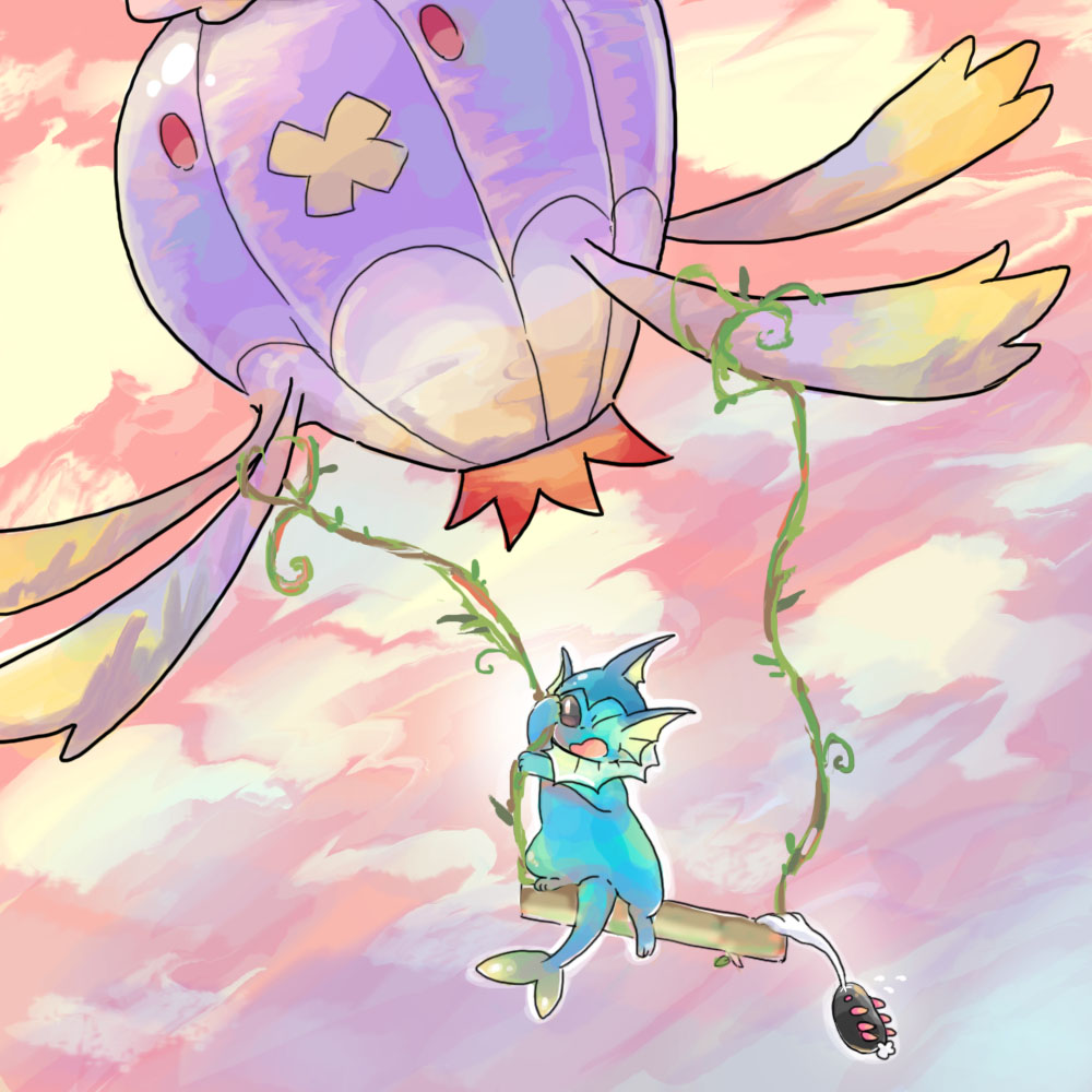
Now, I hope you don't mind me doing a quick and dirty recolor of your art. But I feel it's better to show instead of just tell:
https://files.catbox.moe/2nwe0o.jpg
The red circles are the Visual Tangents I mentioned earlier.