← Home ← Back to /vp/

Thread 58177925

9 posts 4 images /vp/
Anonymous No.58177925 >>58177938 >>58177950 >>58178133 >>58178139 >>58178426
there is so much aura in this cover, it's insane. they will never reach this level again
Anonymous No.58177938
>>58177925 (OP)
This was the peak
Anonymous No.58177950 >>58178139
>>58177925 (OP)
I find it funny how its literally just the Sugimori artwork and yet you're right.
The sharper artstyle, the pose as though Zard is looking towards an oncoming enemy, the expression.
Definitely better than the boring default pose ass stock artwork looking things we get these days. The fact that it's different artwork to Charizard's original Sugimori artwork helps too. Shame we can't get something similar with, say, the motorbike duo, where they're posed more dynamically.
Anonymous No.58178133
>>58177925 (OP)
Its hard to compete with your original creations they were made out of pure creativity everything after that is just trying to catch that buzz again.
Anonymous No.58178139 >>58178222
>>58177925 (OP)
>>58177950
I wish they would lean hard into this aesthetic again, just for one game. It's so distinct, it's uniquely Pokemon.

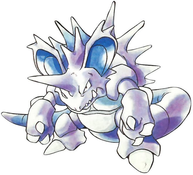
The watercolor style is evocative of childhood adventure, but Sugimori still made monsters that looked brutal. Nidoking used to look better. So much spikier.
Anonymous No.58178157 >>58178217
>Dude what if we just made the cover a stupid fire lizard with a red background
Anonymous No.58178217
>>58178157
Yeah because the other games in the main series do so much better, right?
Come off it.
Every other game in the series does this except at least this one uses alternate artwork from Charizard's Red and Green art whereas everything else is just the typical promo art. GSC were the last games before they just used the initial sugimori artwork on a flat background for everything else with the exceptions of XY and Gen 7 which use the initial sugimori artwork on a visually interesting background for once.
Anonymous No.58178222
>>58178139
Its too outdated nowadays. Media is very bright and those dull watercolor designs wouldn't appeal to the Gen Alpha brain rot culture
Anonymous No.58178426
>>58177925 (OP)
The watercolor art feels more organic, like how someone drew this majestic creature they saw out in the wild. It really adds to the documenting nature of "Gotta catch 'em all!". Fits with the old fashioned nature of the GB games too