>>11916469
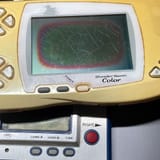
Early GBA games didn't always account properly for the screen, and COTM was such a title.
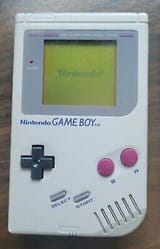
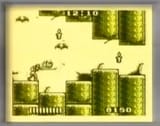
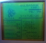
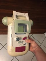
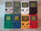
It was tougher to see than my Game Boy Pocket screen, because there was no (non-hidden) contrast dial, and the graphics themselves did not have the same kind of sharp and clean contrast, as now it was 32-bit and they went for all kind of detail, shading, and color.
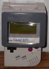
Looked good, but also demanded much more precise and ideal lighting than the old 8-bit ones. I remember I looked for a while in my grandparents's house to find a spot, but when I did, it was crystal clear.
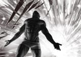
HOD was conscious of this, as said, and overcompensated, they went hard on the contrast and saturation to be more easily readable.
When you emulate or play with a lit screen, this ends up looking rather garish, but this actually grew on me a lot, it's a bit of a surreal and almost dreamlike aesthetic. Some people want to use a patch to tone the palettes down, and I could see why, but I don't want that, I like the overpowered colors, they make me think of old comic books, and schlocky Italohorror like Suspiria.
