← Home ← Back to /g/

Thread 105683343

131 posts 82 images /g/
Anonymous No.105683343 >>105683369 >>105683380 >>105683460 >>105683536 >>105683889 >>105684269 >>105684588 >>105685816 >>105685876 >>105687041 >>105687059 >>105687469 >>105687576 >>105689519 >>105690905 >>105691497 >>105692875 >>105693044 >>105693896 >>105695697 >>105696435
Just imagine what the icons will look like in another 5 years
Anonymous No.105683365 >>105685792
None of the change is necessary
Anonymous No.105683369 >>105683805
>>105683343 (OP)
what the actual fuck is that image. is it ai generated? it doesnt make any sense
Anonymous No.105683380 >>105683426 >>105684672 >>105687471
>>105683343 (OP)
i thought this was the update where they brought back the depth and sovl to designs
also what is the rocket launcher robot app im curious
Anonymous No.105683383
Sequoia was a pretty good balance. I am curious how far it'll devolve after Tahoe though. I genuinely can't think of how more minimalist you can make it while also keeping it understandable, but they clearly said they want this to be the next 10 years of design like iOS 7 was.
Anonymous No.105683426 >>105685824
>>105683380
>also what is the rocket launcher robot app im curious
Automator. It allows you to to script various macOS actions.
Anonymous No.105683460
>>105683343 (OP)
Tinker tranny obsession with icons, I don't care as long as it keeps working and they don't add ads to desktop like winjeets, not my problem.
Anonymous No.105683484
most right looks best
Anonymous No.105683536 >>105683975 >>105684340 >>105685310 >>105688621 >>105692875
>>105683343 (OP)
The new Preview icon is just a really shit drawing of a loupe, the perspective is weird
Anonymous No.105683600 >>105686454 >>105686949 >>105693108 >>105699424
RETVRN to icons with distinct silhouettes (App Store, Dashboard, iTunes, Launchpad, and Time Machine all being circles with a monochrome symbol was clearly the beginning of the end)
Anonymous No.105683776
A foolish consistency is the hobgoblin of little minds
Anonymous No.105683791 >>105686979
In the WWDC video they talk about unifying icons across platforms, which means getting rid of anything that sticks outside of the square on macOS since iOS doesn't allow that. For the contacts app, they moved that tabs inside of the square, which pushes the symbol off-center. However WatchOS and VisionOS still use circular icons. The new circle icon looks more like a game of Simon than an address book.
Anonymous No.105683805
>>105683369
the text are the names of the macos releases. each quadrant is a progression of three releases, going forward in time
what don't you understand?
Anonymous No.105683838 >>105683889
Can we go back to frutiger aero?
Anonymous No.105683889 >>105688649
>>105683838
No, kill yourself zoomer.
Flat UI is perfect and it should stay as is, here >>105683343 (OP) icons on the middle look perfect, sadly jeets crawled in Apple and created abomination they call "Liquid Glass", a shit initially intended for Apple's Vision headset, it will always look off on flat 2D screen.
Anonymous No.105683975 >>105684575 >>105689282
>>105683536
>check these images
>science beaker looking thing your images
>UFO
lol
Anonymous No.105684014 >>105684273
I hate how just a few years ago Apple wanted macOS icons to be rounded squares but a bit "playful" so they wanted you to have elements of them sticking out a bit when appropriate, and now they're just going full "EVERYTHING PERFECTLY SQUARE, NO EXCEPTIONS".
Anonymous No.105684269
>>105683343 (OP)
Why do the tahoe ones look a lot blurrier?
Anonymous No.105684273 >>105684289
>>105684014
Liquid Glass designer is a jeet so it makes sense.
Anonymous No.105684289
>>105684273
I like the liquid glass effect but it doesn't need to be on literally everything, especially icons.
Anonymous No.105684340
>>105683536
>have to write 'preview 10x' to make the loupe recognizable
>but making it readable would ruin the simplicity
>so dark grey font on near black
Im no UX designer, but that's really fucking bad
Anonymous No.105684575 >>105688658
>>105683975
Anonymous No.105684588 >>105685304 >>105687587
>>105683343 (OP)
Instead of removing the pen completely, why not do something like this?
Anonymous No.105684672
>>105683380
>rocket launcher
dildo
Anonymous No.105684771 >>105685093
You thought flatshit was dead, but it's back, and better than ever!
Thank you mr. apples for subverting my expectations!! This changes everything....................
again.
Anonymous No.105685093
>>105684771
I think the idea was on Vision OS that the layers would parallax when moving, giving a sense of depth. But on 2d displays, everything just looks flatter than ever since there's no outlines and lower contrast.
Anonymous No.105685304 >>105694786
>>105684588
Erm...that would block the liquid ass, saar. Please understand.
Anonymous No.105685310 >>105685719
>>105683536
This pisses me the fuck off. What the fuck are they thinking with that Tahoe icon?
Anonymous No.105685719 >>105685722 >>105686090
>>105685310
>This pisses me the fuck off.
Anonymous No.105685722
>>105685719
Let me have my melty
Anonymous No.105685792 >>105686233 >>105686681 >>105689448 >>105690004 >>105699617
>>105683365
It's necessary you faggot.
They have artists on staff, artists should work. It is therefore necessary for us to have constant change.

What do you propose? We never update them then they look all blurry to us in 10 years when display standards change? huh? come on bozo, what do you suggest? We all go back to 16x16 icons?
Anonymous No.105685816 >>105687104
>>105683343 (OP)
>Catalina's settings icon shows the OS working together
>Sequoia on has the gears overlaid but not working together
Jobs is spinning in his grave and Tim Apple doesn't understand why.
Anonymous No.105685824 >>105686110 >>105687426
>>105683426
Wasn't that introduced in OS X 10.4? I remember it being around like 2005-2008 and never using it.
Anonymous No.105685876
>>105683343 (OP)
Catalina has so much soul its crazy.
That book and robot are so cute and much easier to quickly recognize at a glance compared to the globohomo morphed crap that all looks identical which any DEI retard can design (bye bye job security).
Anonymous No.105686090
>>105685719
I look like this and say this when using the new Mac OS beta
Anonymous No.105686110
>>105685824
I mostly use it to batch convert images, turn images into a PDF or PDF into separate images. It's mostly just a visual frontend for Apple Script. I think they've stopped developing it and want everyone to use Shortcuts even though it doesn't really do as much.
Anonymous No.105686118
New to Mac how do I customize and have the nicer icons?
Anonymous No.105686233 >>105689025
>>105685792
>bozo
Anonymous No.105686454 >>105686575 >>105689964
>>105683600
god it looks so cool, i want a mac now
Anonymous No.105686575
>>105686454
Should've got one 15 years ago then
Anonymous No.105686681 >>105689031
>>105685792
>What do you propose?
Remake the actually good looking icons in higher resolutions. There's also the option of doing the first thing while adding the new shit icons so that the artists have more work.
Anonymous No.105686949 >>105687053 >>105687592
>>105683600
That font is sovl
Anonymous No.105686979
>>105683791
bet all icons will be circular in couple of years
Anonymous No.105687041 >>105687055 >>105687061 >>105687063 >>105687195 >>105690091 >>105693140
>>105683343 (OP)
>everything trends towards looking like Linux icons
Anonymous No.105687053
>>105686949
It was a truly beautiful OS
Anonymous No.105687055
>>105687041
Anonymous No.105687059
>>105683343 (OP)
It's an improvement. The cutesy shit is for babies. Fuck that.
Anonymous No.105687061
>>105687041
>mac is copying linux
Anonymous No.105687063
>>105687041
>linux comes up with original ideas
Anonymous No.105687078 >>105687095 >>105693390
Anonymous No.105687095 >>105690024
>>105687078
not even. it will stop existing in 10 years
Anonymous No.105687104
>>105685816
the gears in the second and third example don't even look like they have appropriately-shaped teeth. the second one obviously wouldn't mesh at all and is so deformed it doesn't even really look like a gear at all. the third at least looks like a gear but the dimensions are still fucked up. and what does a gear behind a gear even mean? the first one shows looking into something at a gear which is meshed with other gears. which a really smart way to visualise looking at internal settings
Anonymous No.105687124 >>105687156 >>105687169 >>105690063
>old icons: aim to convey what they represent in a quick and easy to read manner
>new icons: aim to resemble the old icon only, often missing crucial elements of the old icon in the process
Anonymous No.105687156 >>105690287
>>105687124
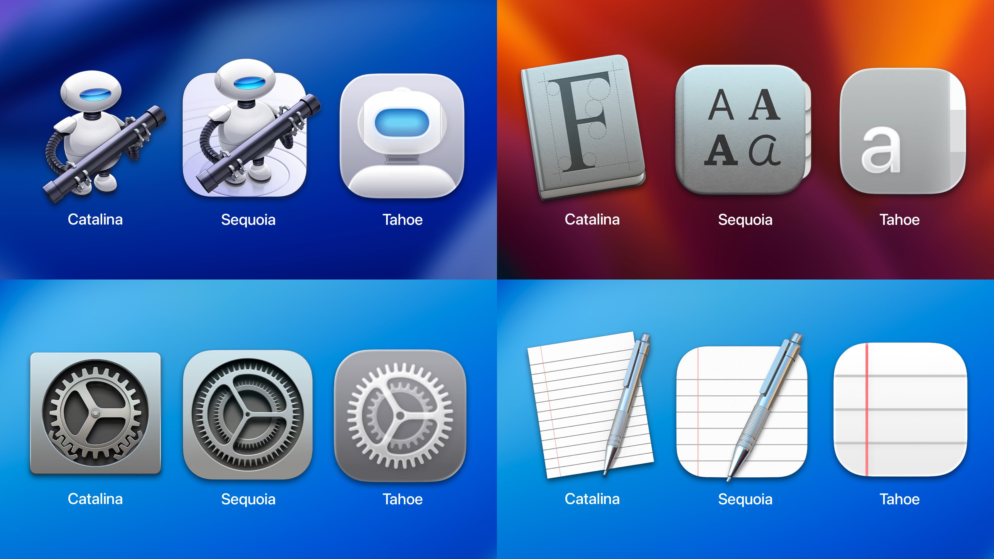
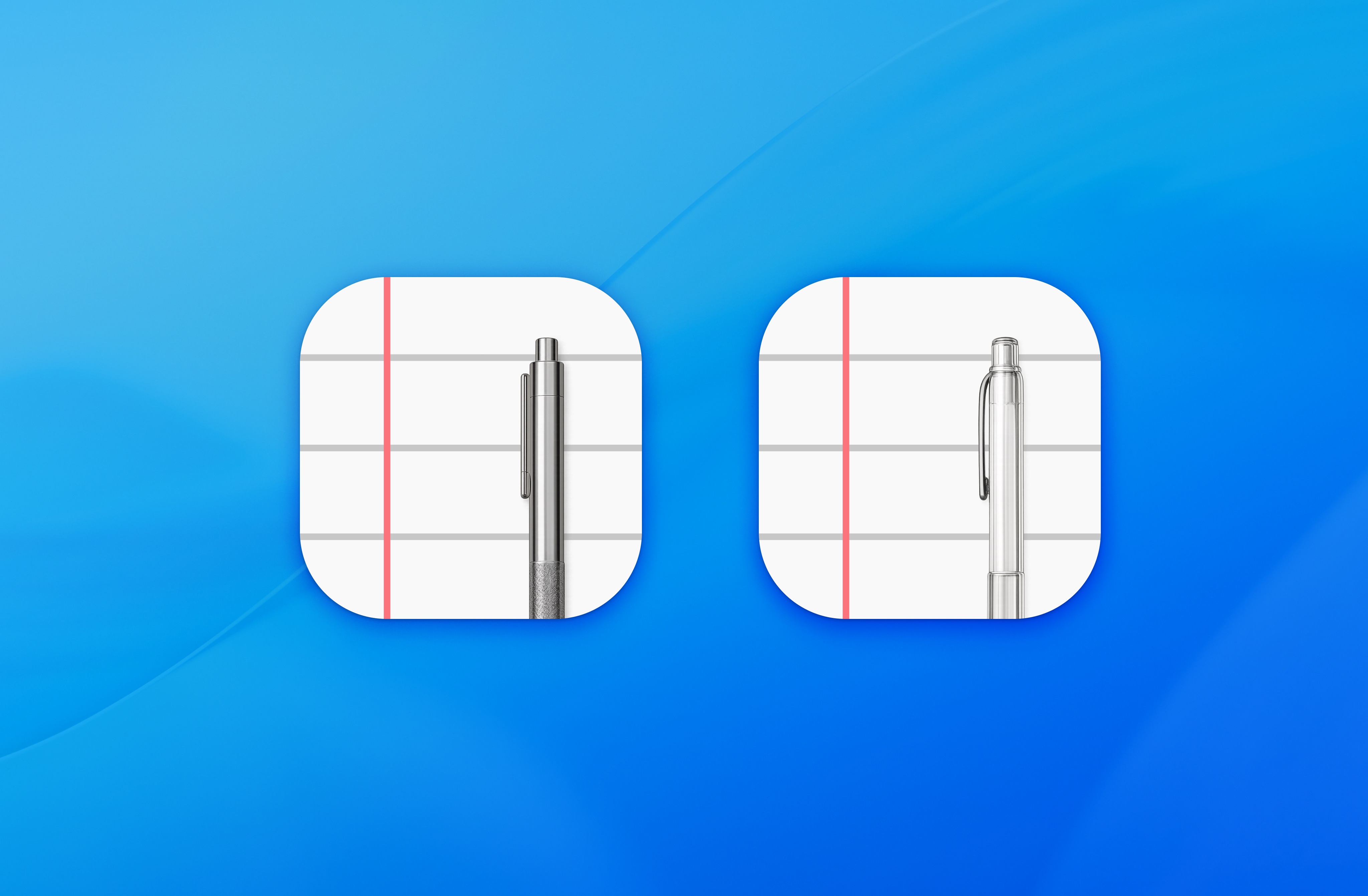
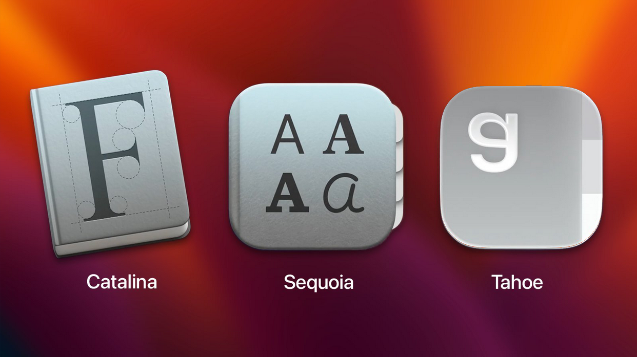
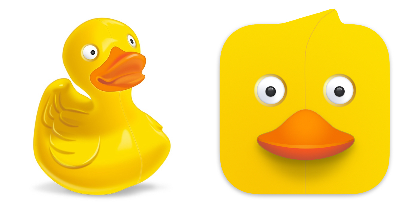
-- like look at that font one. first one shows on obvious realistic book, with a character that has construction lines around it. i can tell despite having not seen it before that this is something related to the display, storage or creation of fonts.
the second one looks vaguely like the first, but it may be difficult to tell that it's a book without remembering the first icon. basically it reminds you of the first icon, rather than what it's supposed to directly
the third one barely resembles the second icon. by itself i'd never know it was a book. the "a" lacks the construction lines of the first and font variants of the second, so it doesn't even bring "fonts" to mind. if you showed me that on its' own i'd assume it was just some program that use an "a" in it's logo or something
Anonymous No.105687169
>>105687124
Yeah. What the fuck does "a" mean? The first one has a "F" which stands for "font". Fair enough. The next one has "a"s in four different styles. Makes sense. The last one is just an "a" on it's own. That means absolutely nothing unless you know the previous icon it's referencing.
Anonymous No.105687195
>>105687041
that's offensive to linux icons
Anonymous No.105687426
>>105685824
Yup. It basically is a visual programming tool built atop Applescript.
Nowdays, you can use it, write AppleScript, or write Javascript to automate your Mac, or just use more powerful tools like Keyboard Maestro to do it
Anonymous No.105687469 >>105687480 >>105691561
>>105683343 (OP)
what did they mean by this?
Anonymous No.105687471
>>105683380
looks like it's meant to be a pipe, but that's a reference only *nix geeks would understand
Anonymous No.105687480
>>105687469
that icon progression is literally the "Firefox" > "Pls hlp" > "a" meme
Anonymous No.105687576
>>105683343 (OP)
Anonymous No.105687587
>>105684588
How would you do the pen as one or more layers of glass
Anonymous No.105687592
>>105686949
lucida is the name of the font btw
Anonymous No.105688621
>>105683536
>big sir
>look like shit
quintessential poo moment
Anonymous No.105688649 >>105694786
>>105683889
>liquid ass
is that what poo call diarrhea?
Anonymous No.105688658
>>105684575
now replace the coffee with a child and make the text rabbi x10
Anonymous No.105689025 >>105690108
>>105686233
Yeah, bozo! bozo the clown!
Anonymous No.105689031 >>105689684
>>105686681
>remake the good ones
so, repeat work, baby ducking over icons?
>There's also the option of doing the first thing while adding the new shit icons so that the artists have more work.
>just add bloat bro
baby ducks are not a reason to bloat the fuck out of your operating system.
Anonymous No.105689189
1
either 1 or 2
maybe 1
2
Anonymous No.105689282
>>105683975
literally chinese whispers
Anonymous No.105689448
>>105685792
I'm still using 4:3 as dog intended in ~100ppi (not 96 but close enough). It's harder nowadays to find a good monitor, but it's doable. I'm running 1920x1440 at 23.6" on dual LG dual up 27.6". It's the best for me. It has common 1920 in width, have more vertical space and have no niggerlicious aspect ratio. Higher resolutions make things too small and I refuse to use scaling. I like crispy icons and fonts, not some bullshit vector vomit.
Anonymous No.105689519
>>105683343 (OP)
I am not updating lmao, fuck these cunts.
Anonymous No.105689684 >>105689971
>>105689031
A couple more icon packs is bloating the fuck out of something? I forgot this place becomes worse once it's summer.
Anonymous No.105689964
>>105686454
I think the same thing every time I see the $600 mini, but then I remember they look nothing like that.
They don't make 2014 era macs anymore, and the ones built back then are barely supported.
My 2011 MBP is good enough to scratch the nostalgia itch whenever it strikes though. I just boot up mavericks, which is the last OSX that has its soul intact.
Anonymous No.105689971 >>105690475
>>105689684
Your presence on this earth is bloat.
If you have nothing to add, cease.
Anonymous No.105690004
>>105685792
>then they look all blurry to us in 10 years
Mac's icons from 10 years ago look better and crisper than the new ones.
Anonymous No.105690024
>>105687095
>changes icon to trans flag
>kills itself
What did firefox mean by this?
Anonymous No.105690063 >>105690142
>>105687124
Even worse. The new icons aim to resemble each other in shape, color and silhouette, to become uniform, which is the exact opposite goal of what an icon should do. The point of an icon is to be immediately recognizable from the rest, so that you can find it quickly.
Anonymous No.105690091
>>105687041
do you mean linux troons stole them from iOS?
Anonymous No.105690108
>>105689025
nigger
Anonymous No.105690142
>>105690063
>The new icons aim to resemble each other in shape, color and silhouette
Anonymous No.105690287
>>105687156
In line to every other area of Western civilization where the capability for human creativity is disappearing. Endless remakes and remasters, self referential culture, and no original creation in sight. Humans are enslaved by the spirit of Ahriman, and by the time we've shoved LLMs in our brain we won't even notice the difference anyway.
Anonymous No.105690475
>>105689971
Someone didn't get his chicken nuggies?
Anonymous No.105690905 >>105691029
>>105683343 (OP)
tbqh though, if you saw them all on the dock, all the redesigns would probably look a lot neater
Anonymous No.105691029
>>105690905
they'd all look similar, is a BAD thing for icons
Anonymous No.105691497 >>105691570 >>105692103 >>105693108 >>105699829
>>105683343 (OP)
Frankly we need to go back even further. Pic related: Snow Leopard. Notice how absolutely *lush* everything is. A feast for the eyes.
Anonymous No.105691550
There is no firewire driver so far in Tahoe
Anonymous No.105691561
>>105687469
lole cade fage
Anonymous No.105691570 >>105691596 >>105691650 >>105692106 >>105693827 >>105694082
>>105691497
>that fucking duck
Anonymous No.105691596
>>105691570
It can also show up in the menu bar
Anonymous No.105691650
>>105691570
>Now only if he finds a girlfriend...
literally me
Anonymous No.105692103 >>105692132
>>105691497
For me, Jaguar hit the absolute peak of aesthetics

https://infinitemac.org/2002/Mac%20OS%20X%2010.2
Anonymous No.105692106 >>105693827
>>105691570
I fucking miss Adium. You can install it still, but nothing works with it anymore
Anonymous No.105692132 >>105692198 >>105693002
>>105692103
Anonymous No.105692198 >>105692260 >>105693020
>>105692132
why the fuck does it look so good like 25 fucking years later
Anonymous No.105692260
>>105692198
because things have only gotten worse
Anonymous No.105692819 >>105692966 >>105693026
all because of this fucking guy. every single design change in OS X / macOS has been step backwards, ever since he got promoted to design lead around 2015. he was the retard behind Big Sur redesign.
alan fundamentally does not understand Mac as a platform and how to design for it.
Anonymous No.105692875 >>105697387
>>105683343 (OP)
>>105683536
They really are ripping off deviantart themes from 15 years ago
Anonymous No.105692966
>>105692819
Who is responsible for the wobble in iOS? That shit is fucking disgusting
Anonymous No.105693002 >>105693882 >>105694570
>>105692132
it's just NeXTSTEP with a custom theme
Anonymous No.105693020
>>105692198
Scott Forstall left
Anonymous No.105693026
>>105692819
really? hasn't Jony Ive started all that shit
Anonymous No.105693044
>>105683343 (OP)
They'll all be featureless gray boxes, with rounded corners. But that's all right since there will be only about five apps left. You don't need all that customization and features.
Anonymous No.105693108 >>105693882
>>105683600
>>105691497
wish I could still use old versions of OS X without being absolutely locked from fucking everything
Anonymous No.105693140 >>105693159
>>105687041
Linux icons actually look better.
Anonymous No.105693159
>>105693140
bait used to be believable
Anonymous No.105693390
>>105687078
2024 is peak sovl
Anonymous No.105693827
>>105692106
Which is weird, they still have it on Github and the site/server and downloads (even going back to 10.2!) is available, it's just... all the services it ran are no longer available. Either they should pivot to doing Matrix (and Discord, but Discord would frown on that and ban accounts that used it), IRC and the like or just depreciate it.

>>105691570
I didn't mind the duck. But I do agree it was a bit out there for an IM client.
Anonymous No.105693882
>>105693002
...And that's a good thing...

>>105693108
You technically can, but you have to hunt down folks that are doing the work: https://www.theregister.com/2025/04/15/classic_mac_os_apps/
Anonymous No.105693896
>>105683343 (OP)
>robot's RPG is gone
soulless
Anonymous No.105694082 >>105694156 >>105694707
>>105691570
Cyberduck
Anonymous No.105694156
>>105694082
for me its transmit
Anonymous No.105694570
>>105693002
Actually, Mac OS X Server 1.0 / Rhapsody was just NeXTSTEP with a Mac theme. It was the Public Beta and 10.0 of Mac OS X that added a new display server and other upgrades.
Anonymous No.105694707 >>105695535
>>105694082
Du vill conform to ze Squircle
Du vill not put anything outside of ze Squircle
Anonymous No.105694786 >>105697374
>>105685304
>>105688649
>liquid ass
Anonymous No.105694862
i bet the rangeban country did this
Anonymous No.105695535
>>105694707
look how they massacred my boy
Anonymous No.105695697
>>105683343 (OP)
The worst part is you can't escape it. All the security and bug fixes are in the new update. You can kick the can down the road and be the weird guy who doesn't update or you can pay now. Is it weird that I see the beauty of the world vicariously through technology? Maybe that's why it feels so personal with this awful redesign
Anonymous No.105695963
How do I bring actual good skeuomorphism back on mac?
Anonymous No.105696435
>>105683343 (OP)
Anonymous No.105696667
rainbows appear, which means OS X lags
Anonymous No.105696683
The next logical step would have been to make the icons animated instead of simpler.


What a shame! Pain and punishment!!
Anonymous No.105697374
>>105694786
PISSE AUS MEINEM ARSCH!

https://www.youtube.com/watch?v=eF54CujFCpM
Anonymous No.105697387 >>105697415
>>105692875
This looks nothing alike.
Anonymous No.105697415
>>105697387
Pain and punishment!
Anonymous No.105699039
turns out there is no bottom.
Anonymous No.105699387
Liquid Glassass

check out to find out the lore behind the name liquid glass https://watchpeopledie.tv/h/gore/post/72498/classic-1-man-1-jar-full
Anonymous No.105699424
>>105683600
very nostalgic. this is one of the last OSX versions I used
Anonymous No.105699617
>>105685792
lol you realize most shit nowdays is vector graphics?
Anonymous No.105699829
>>105691497
Tiger was kino. But Snow Leopard just hit right.
Anonymous No.105700078
This means that my webm for retards applescript needs a new logo, /g/.