>>106858605
The impression of translucency is usually at odds with legibility.
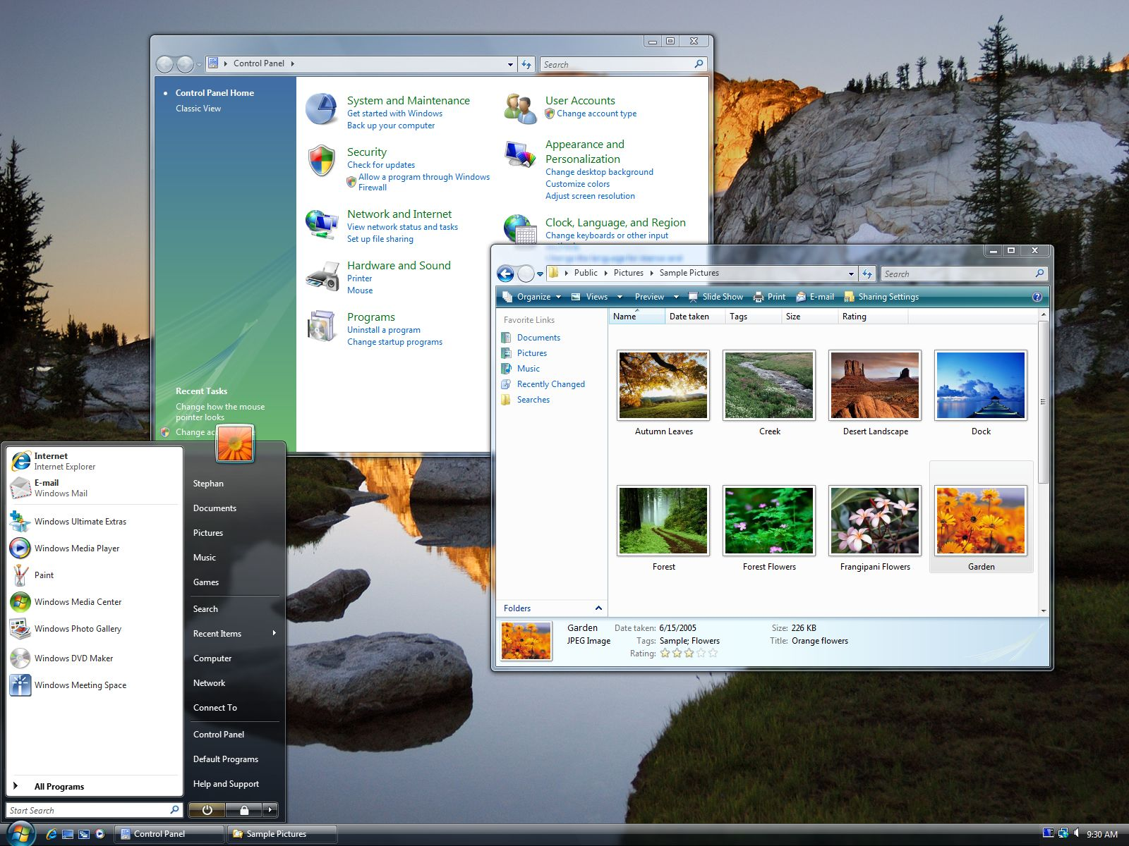
So designers have lots of little tricks they can play. They can decorate the text with outlines, shadows, and glows, as Microsoft did for various elements in Windows Vista. This works but is not particularly elegant, especially for text longer than a few words.
The Liquid Glass texture is more complex than Microsoft’s Acrylic. It warps and distorts at the edges, and the way it blurs background layers is less diffuse. There are inset highlights and shadows, too, and all of these effects sell the illusion of depth better. It is as much a reflection of the intent of Apple’s human interface designers as it is a contemporary engineering project, far more so than an interface today based on raster graphics. That it is able to achieve such complex material properties in real-time without noticeably impacting performance or, in my extremely passive observations, battery life, is striking.