← Home ← Back to /ic/

Thread 7718448

15 posts 8 images /ic/
Anonymous No.7718448 >>7718463 >>7718510 >>7718753
i feel like i completely lost all uniqueness the sketch had but can't my finger on how i did better, how would i go about improving the lineart to look better than it?
Anonymous No.7718453 >>7718457
You had open lines in the sketch. Why did you close them? Also, thin lines might just work better if you're going for energy.
Anonymous No.7718457
>>7718453
just inconsistency from erasing/redoing parts rather than style, though i admit i do think that they might look better overall
Anonymous No.7718463 >>7718474 >>7718500
>>7718448 (OP)
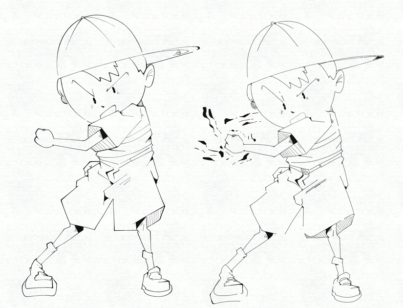
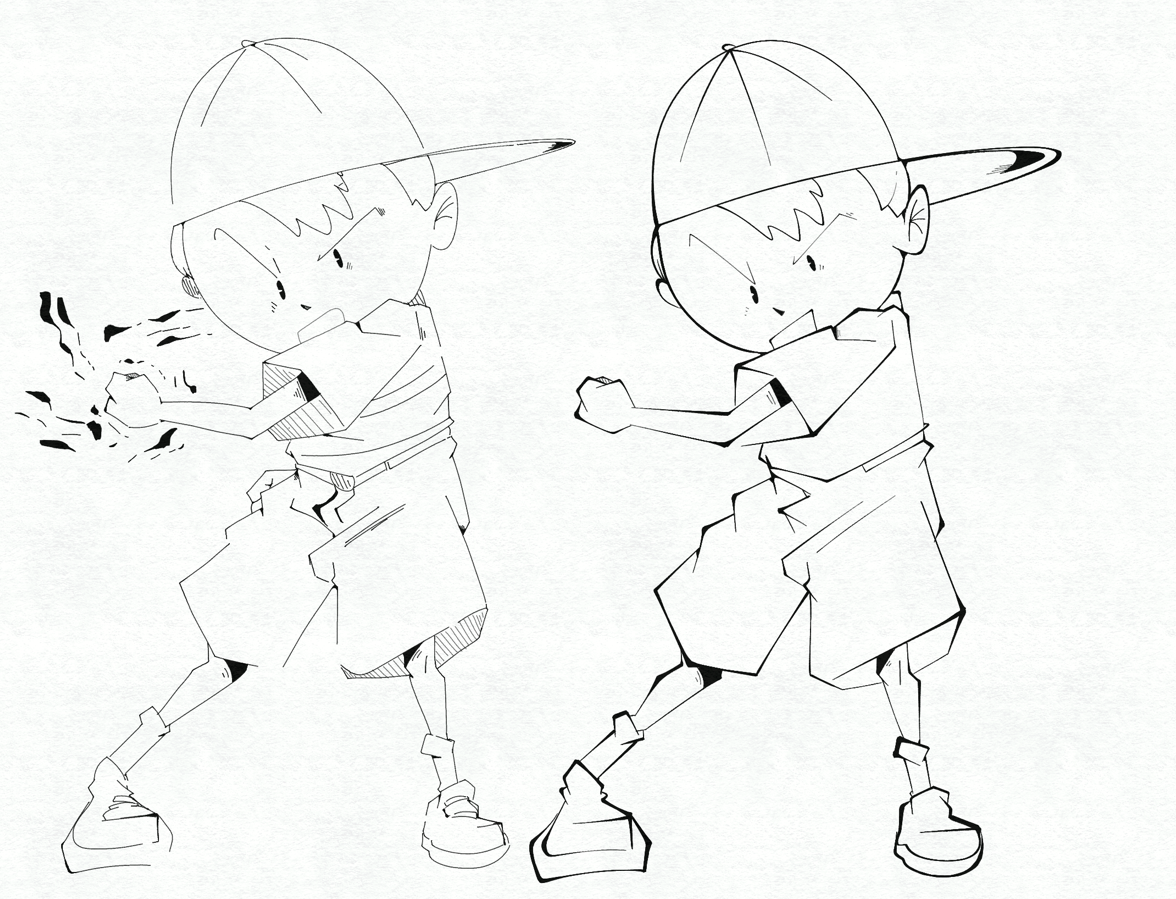
the changes in line weight are too extreme and random. they're too distracting and divert attention away from the focal points like his face or hand (especially his face, the lines are way too light compared to the rest of the body). the sketch doesn't suffer from this problem because the line weight is uniform. try to be more subtle and gradual with the line weight changes, and think hard about the exact reason you're adding it.
Anonymous No.7718469 >>7718474
why not just use the sketch? looks clean enough
Anonymous No.7718474
>>7718469
i actually did end up using the sketch for posting it publicly since i liked it, though my problem is that's how i always sketch. which isn't a bad thing, but i have to be able to know how to line in cases where heavier line weight is beneficial for a piece, i just happened to practice with this one since its the most recent thing ive done

>>7718463
this is actually very helpful advice and i def see it .. i'll try practicing that. thank you!!
Anonymous No.7718500 >>7718504 >>7718591
>>7718463
tried following this, i definitely kind of lost track of the thickness i was doing at some points but i think its a bit of a step up?
Anonymous No.7718504 >>7718506
>>7718500
This is good. What is the context of this image?
Anonymous No.7718506
>>7718504
do you mean like, why i drew it? just for fun
Anonymous No.7718510
>>7718448 (OP)
Looks mostly fine but it does look a bit too clean. It's okay for lineart to look a bit rough and keeping the roughness of the sketch might help. Keeping the actual sketch and just overlaying the lineart on top also isn't terrible since the design isn't overly complex.
Anonymous No.7718591
>>7718500
this looks a lot better and you should keep it as your method moving forward anon. Would look sick with a limited color palette if you plan to add colors
Anonymous No.7718753 >>7718788 >>7719084 >>7720139
>>7718448 (OP)
Cool Ness
Made me want to draw my own - how did I do?
Anonymous No.7718788
>>7718753
I dig it.
Anonymous No.7719084
>>7718753
very fun!! reminds me a lot of how people would stylize kids in the early 2000s
Anonymous No.7720139
>>7718753
Gesture is a little stiff but I dig the linework and style