Search Results

6/29/2025, 1:15:44 PM
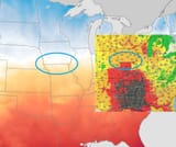
Pic related shows the color scheme the National Weather Service traditionally uses for temperature along with an insert map for the "wet bulb temperature" map. It's interesting that they used a different color scheme for the "wet bulb" map and that it contains weird artifacts like the one shown.
Wet Bulb is what the activists want you to look at now. Apparently everyone understood that the Heat Index was based on perception, which varies by person, so now they use Wet Bulb to sound scientific (anons, it's based on a special formula created by The Science!) and have a reason to come up with an entirely different color scheme for the maps.
Wet Bulb is what the activists want you to look at now. Apparently everyone understood that the Heat Index was based on perception, which varies by person, so now they use Wet Bulb to sound scientific (anons, it's based on a special formula created by The Science!) and have a reason to come up with an entirely different color scheme for the maps.
6/22/2025, 4:51:04 PM
Interesting how temperature changes based on state borders.
Page 1