>>715304516
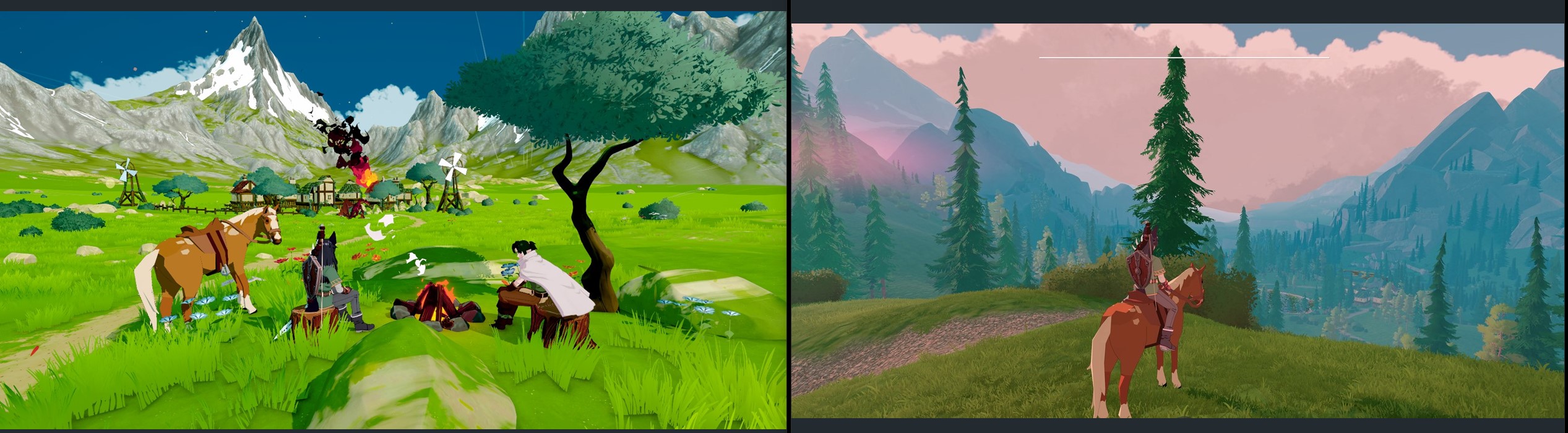
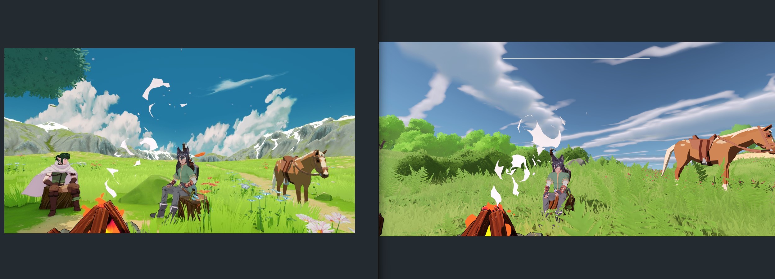
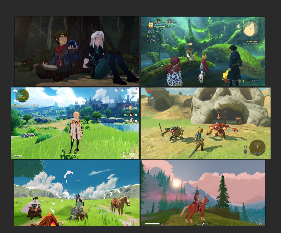
For me, I'd choose the colors of the right but with the shadows of the left
Colors on the right are good because of how I can easily make out all the different midtones of the green, so I can see the depth of the shrubbery despite how overbearing all the green is. The light green for the ground in the left image also looks too bright and overpowering compared to the more relaxed green on the right.
Shadows on the left are nicer because they look more black, so it pops a bit more. It's noticeable on the horse the most, even with the shadows looking glitchy on the left
Can't really give a better comparison since the two images are different. If you want a better, actual critique of your art style, you should use the same shot for both images with the same position, objects, time of day etc