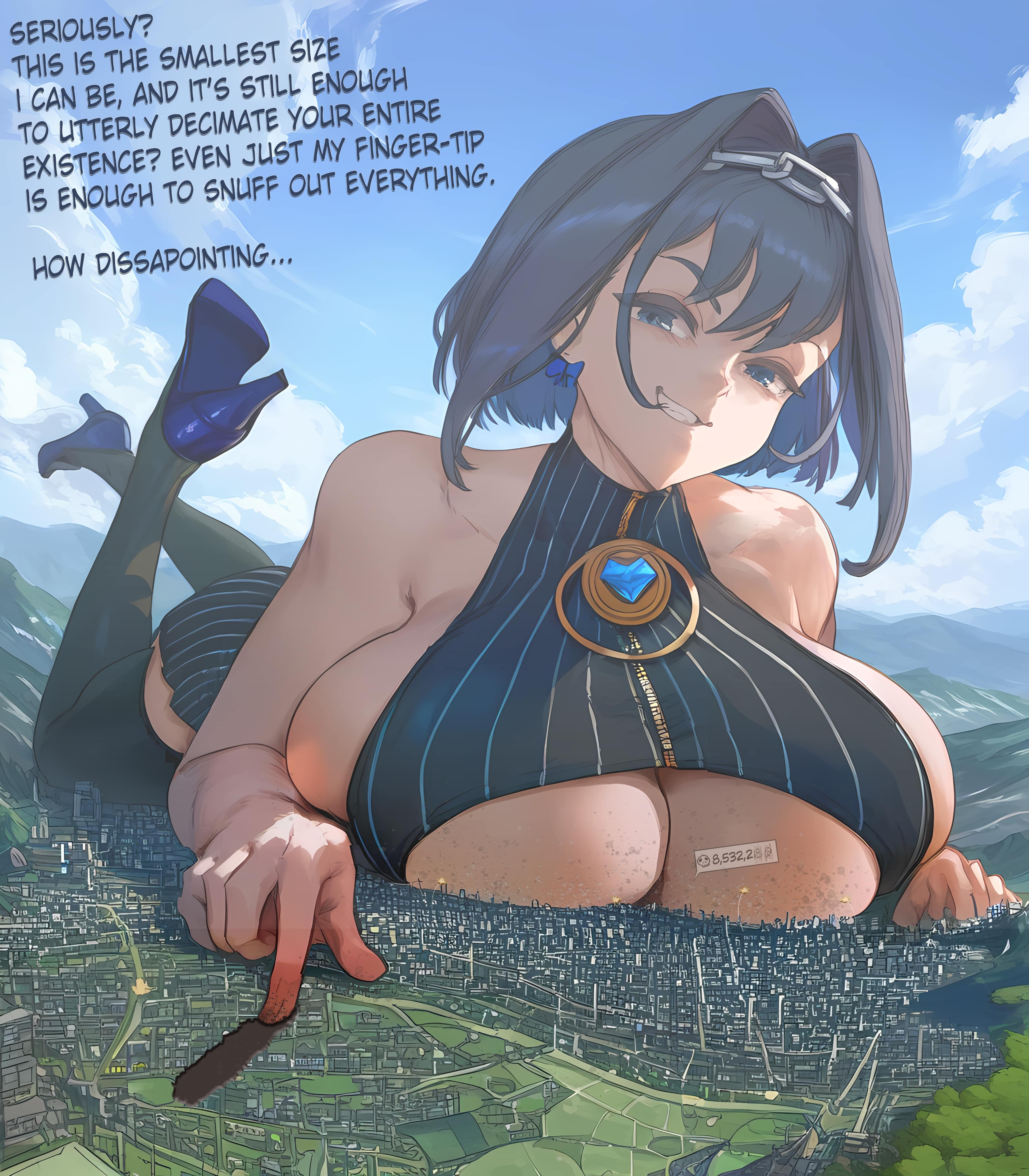
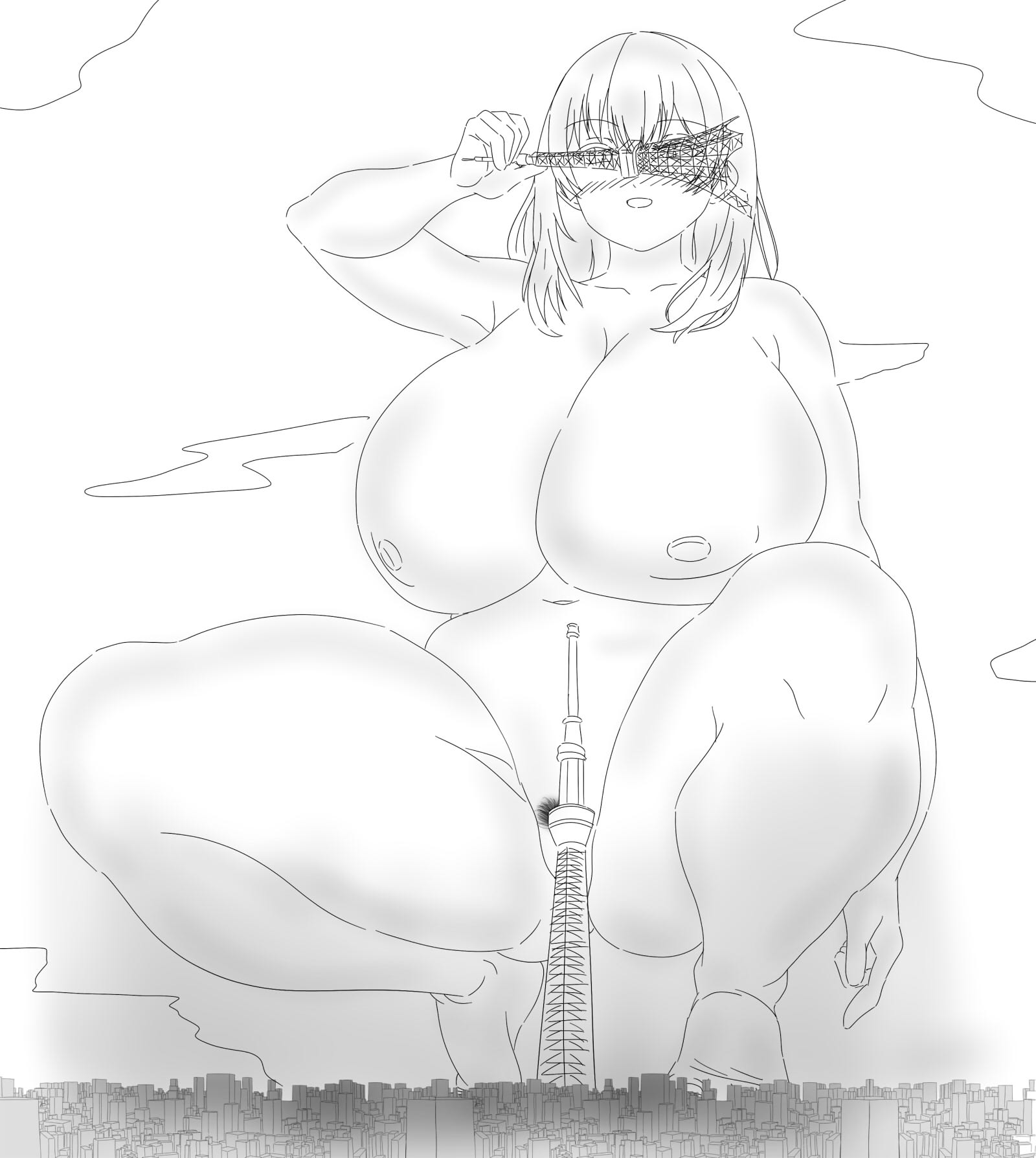
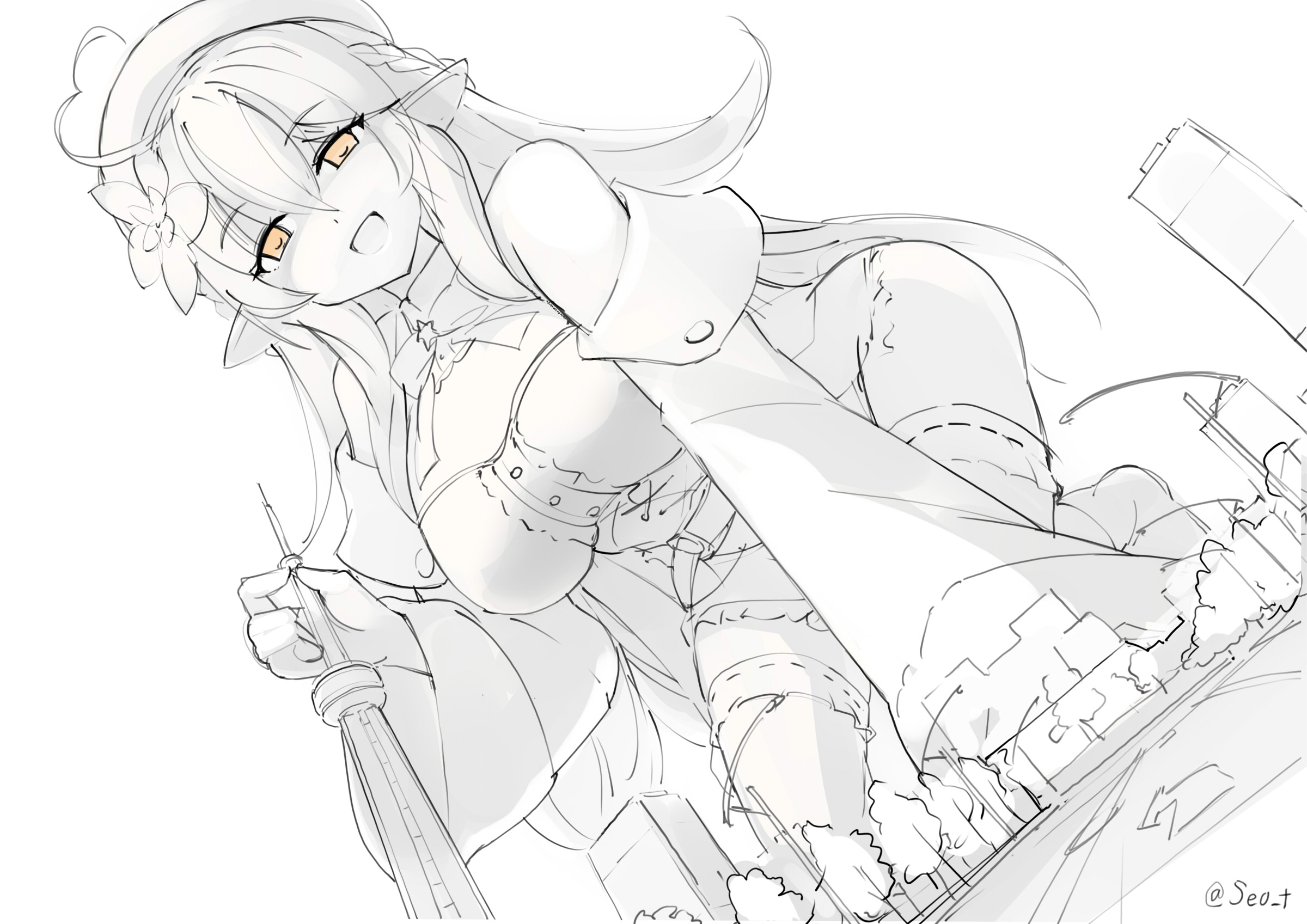
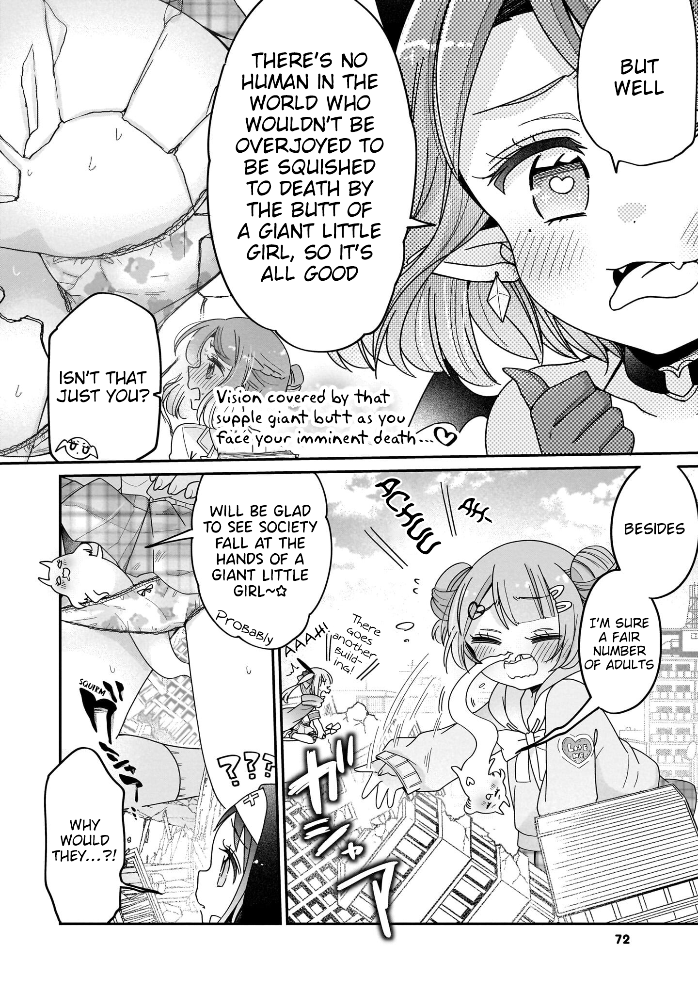
>>11360937
Okay. I'll start with
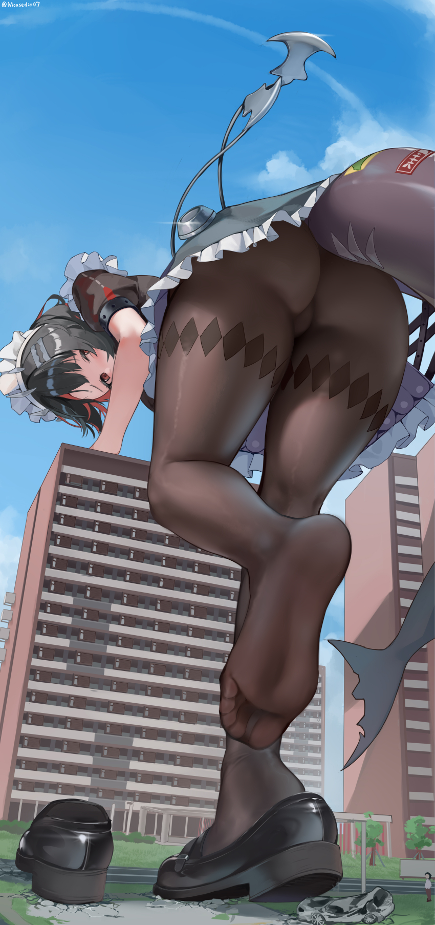
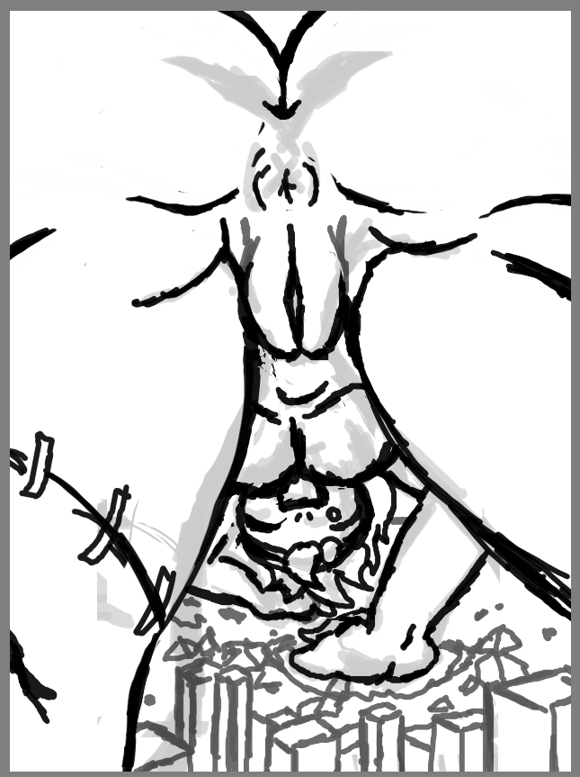
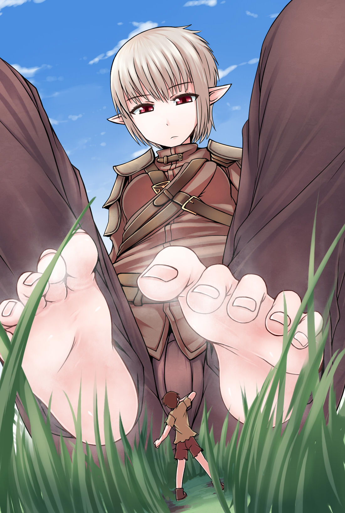
>>11360872
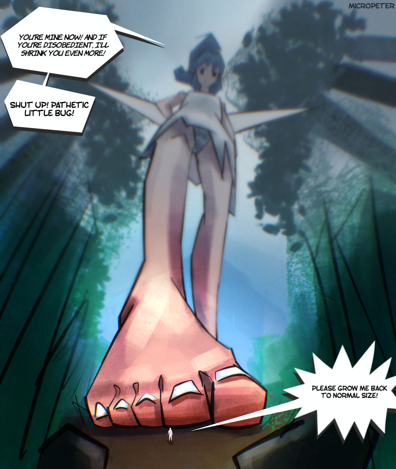
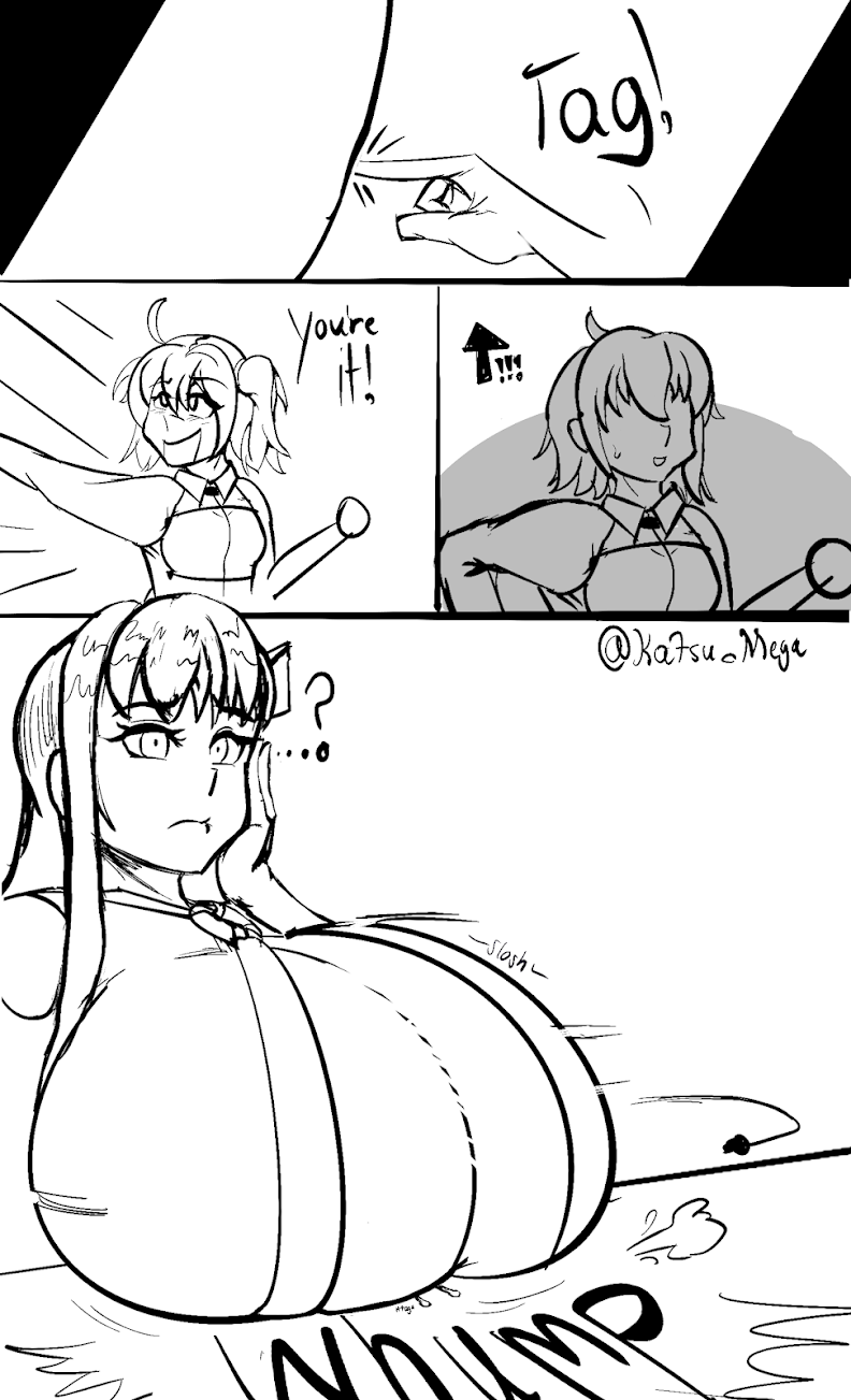
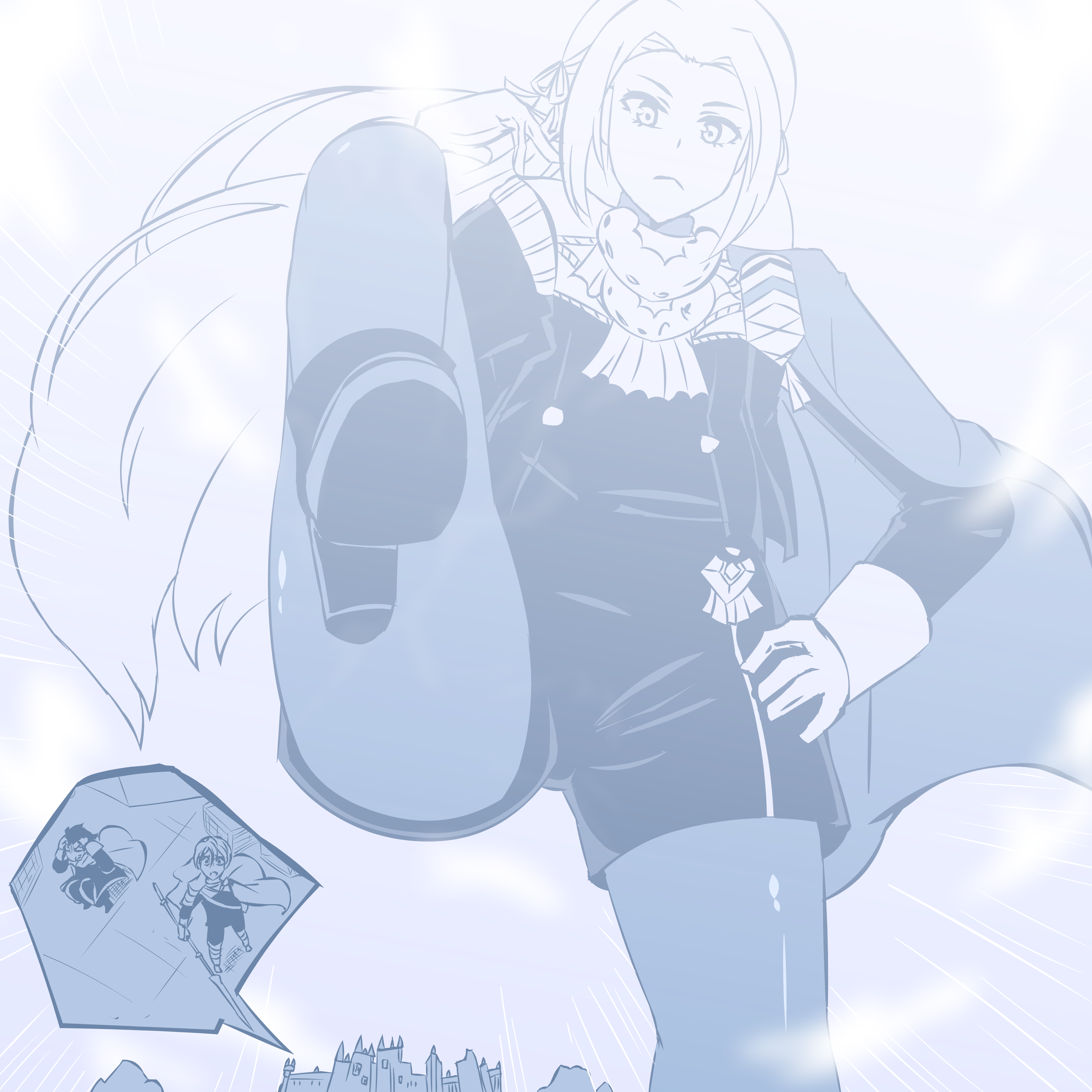
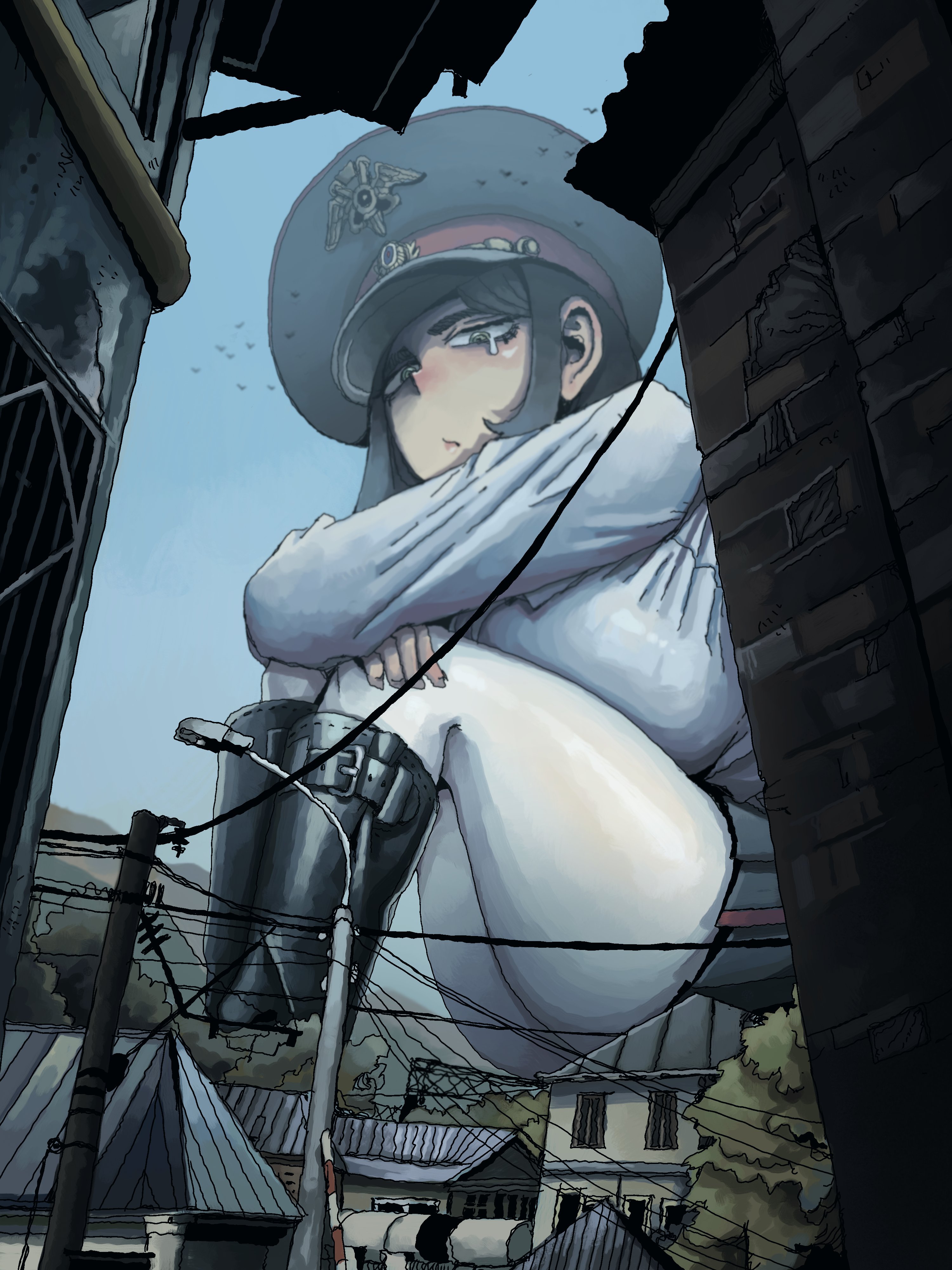
The lines are too thick and opaque and messy. If this is meant to be a sketch, you're making it harder to figure out where the final lines should go. If that's meant to be the line art, it looks like a much lower resolution image was zoomed in/magnified several times. Compare the thickness of your lines to those of other size artists. The full opacity of the lines also hurts your ability to do anything subtle with them, and they are overall very messy/scribbley.
It also looks like you are making very short, rapid strokes rather than longer, more confident strokes. Practice that. Don't draw the same way you write text; try using your whole arm from the shoulder down. It takes a long time to get used to, but it will greatly improve your line work. Look for videos that show professional artists sketching and watch how they use their whole arm to make long, confident strokes.
The line art is so overbearing that it's actually obscuring your ability to depict fine details or subtle contours, which makes the anatomy look harsh and over-drawn, and makes the face look too low resolution to look appealing. I can tell what you're going for, but your line brush is holding you back quite a bit.
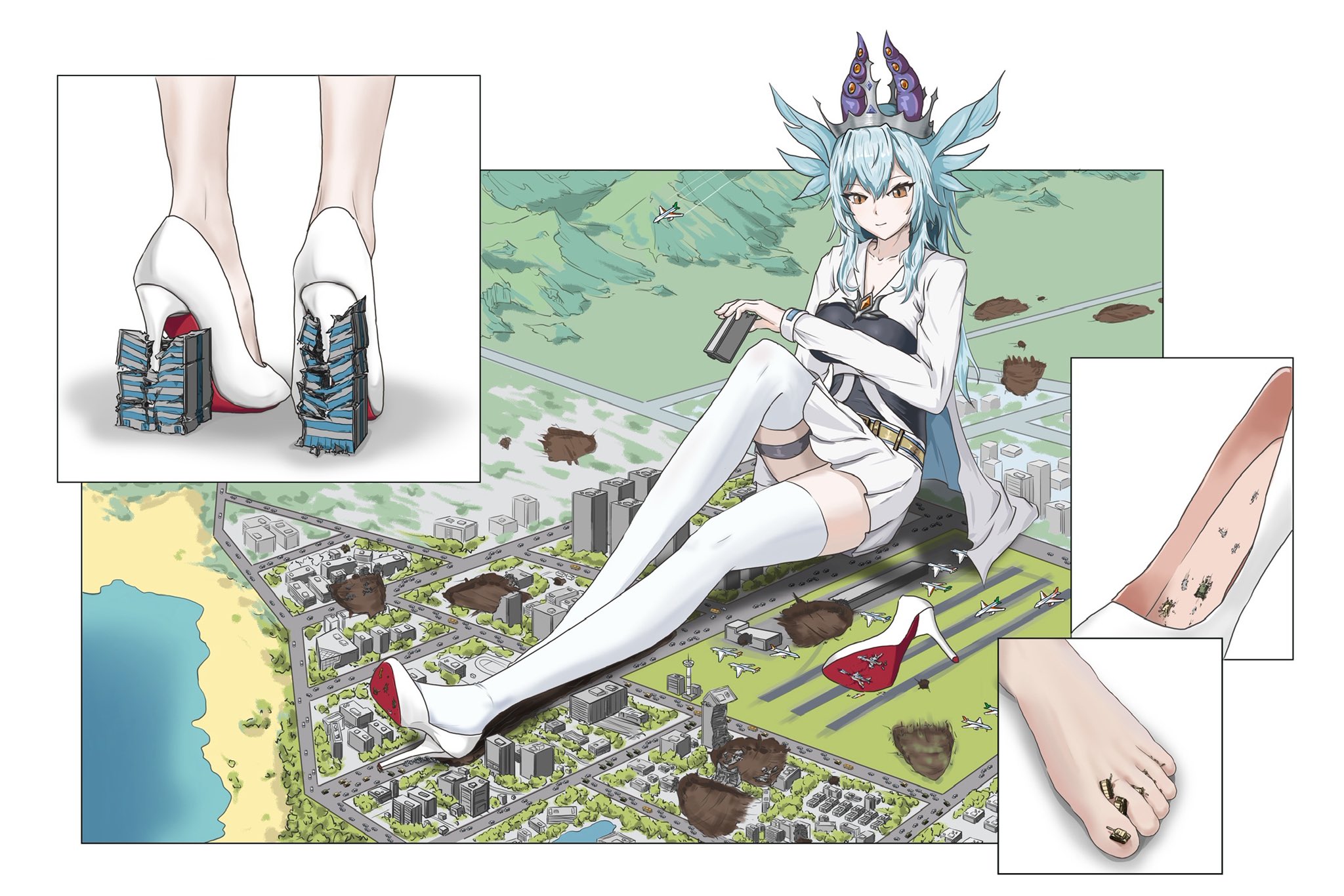
As for
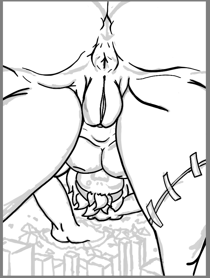
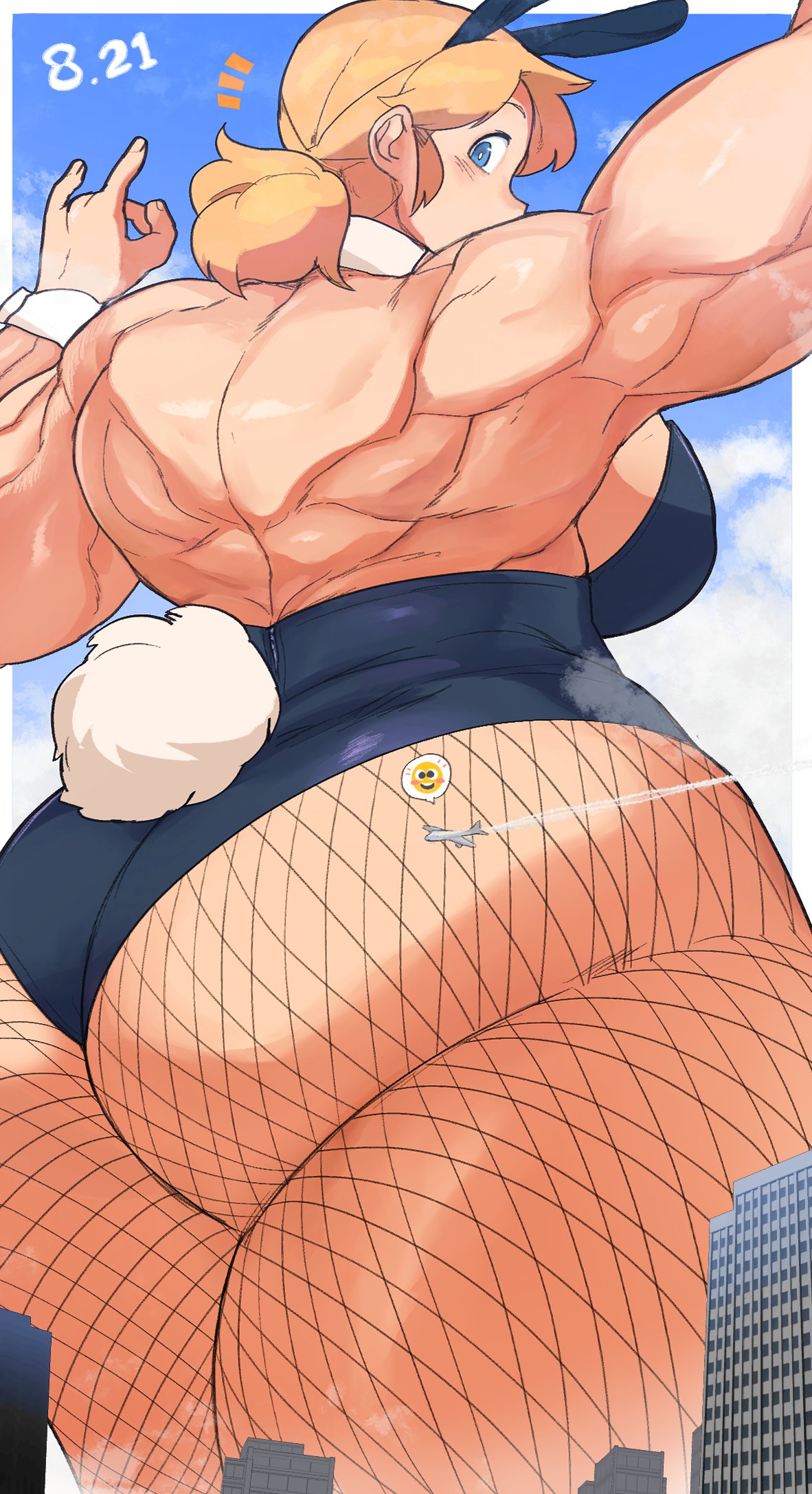
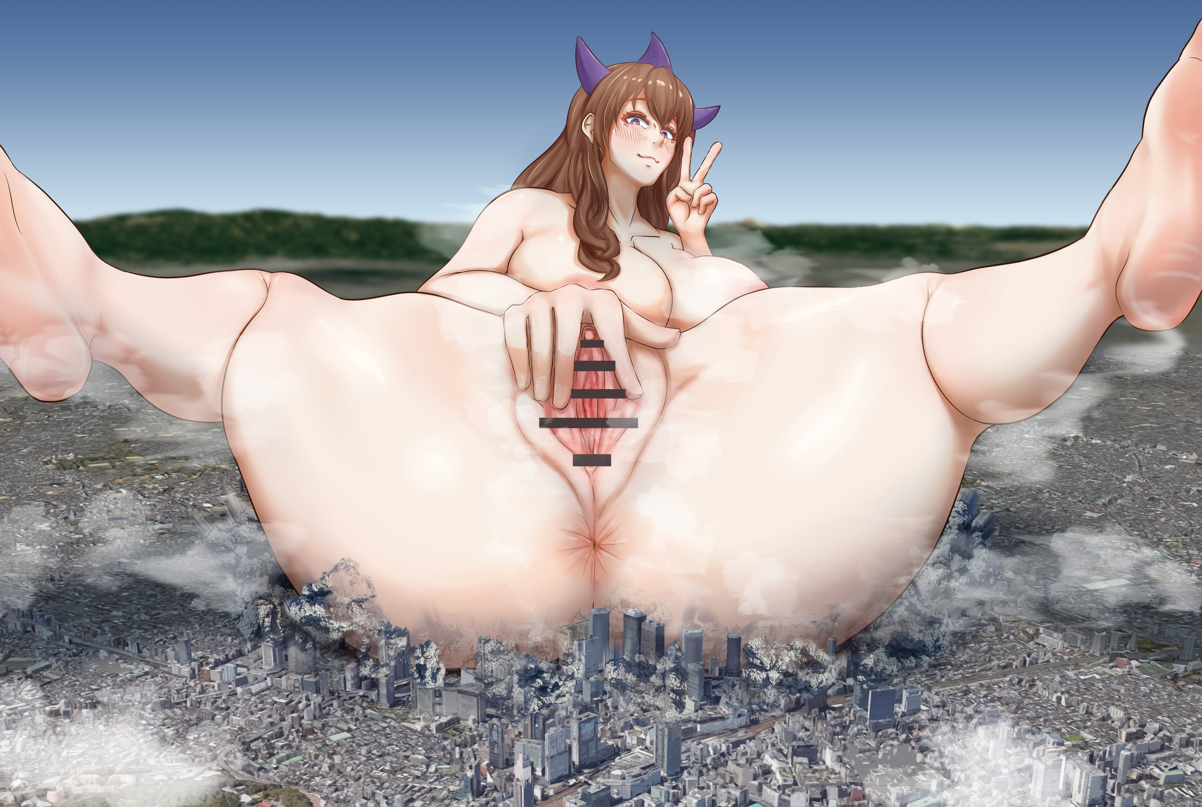
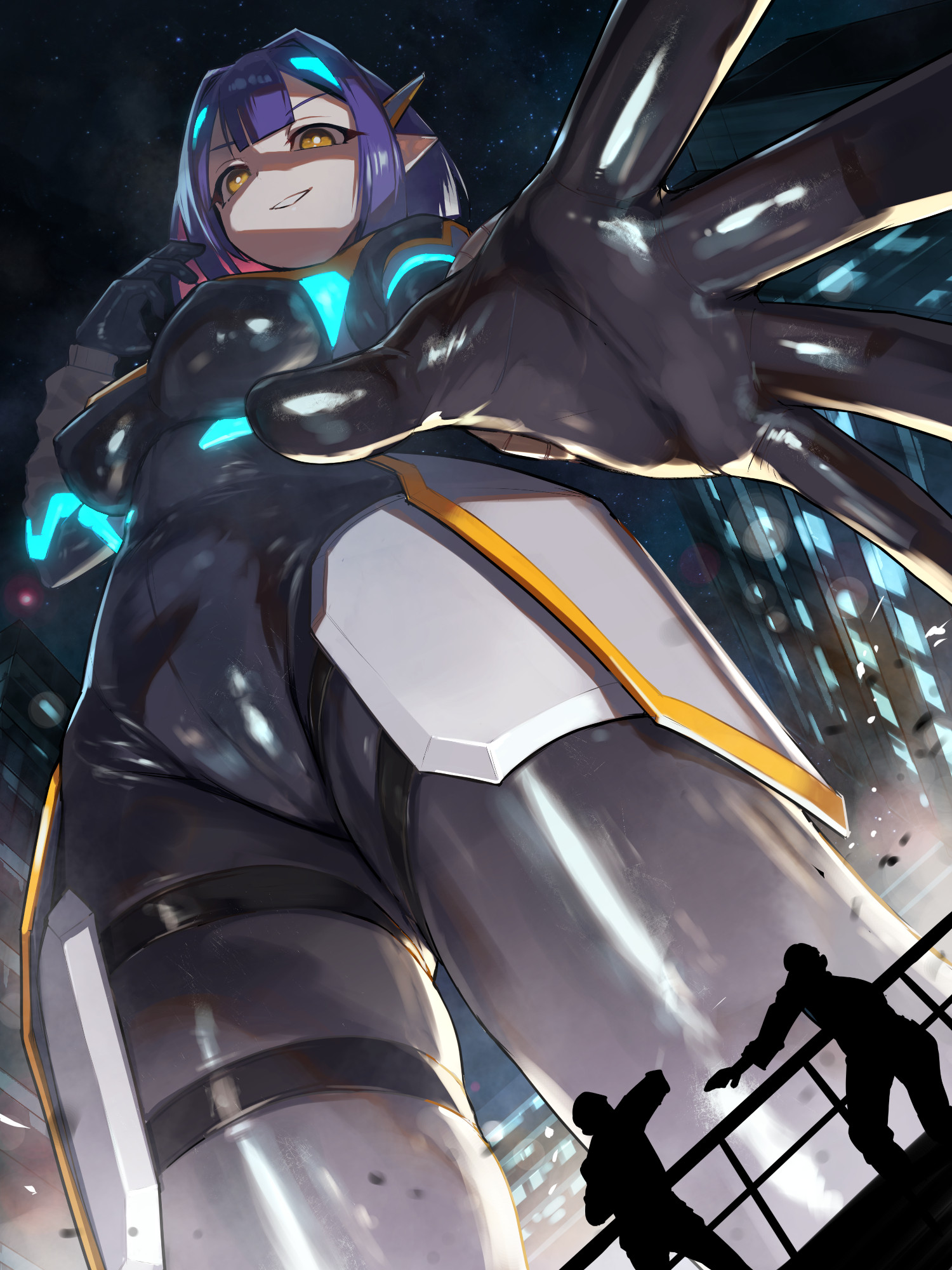
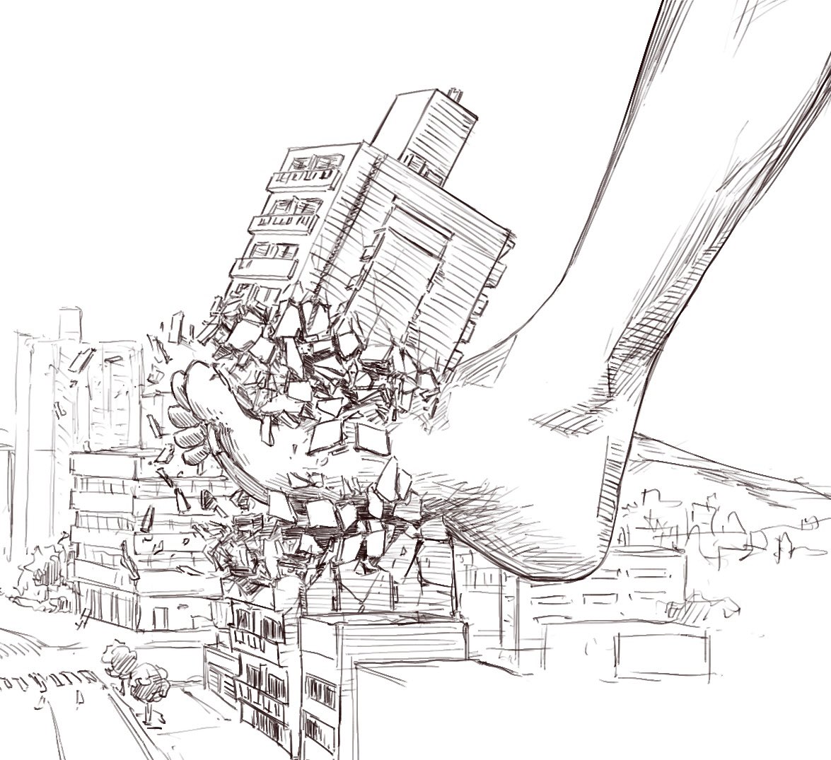
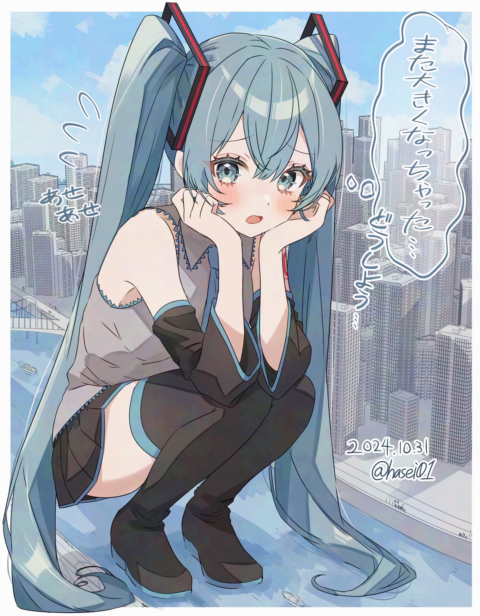
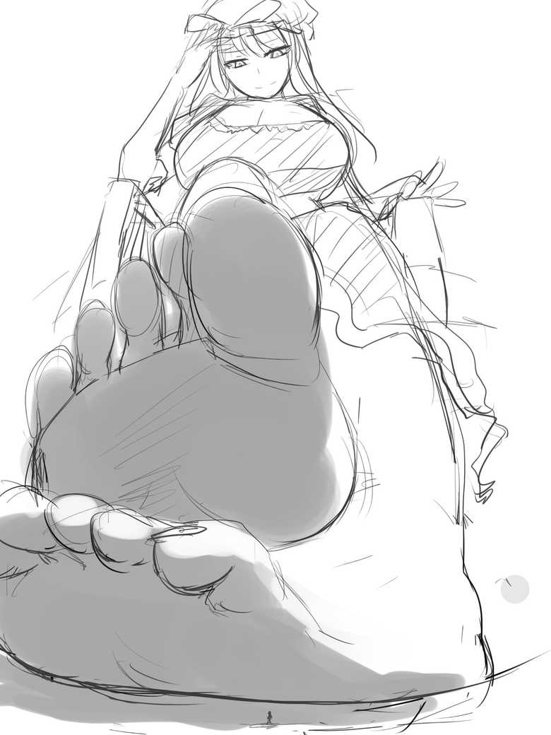
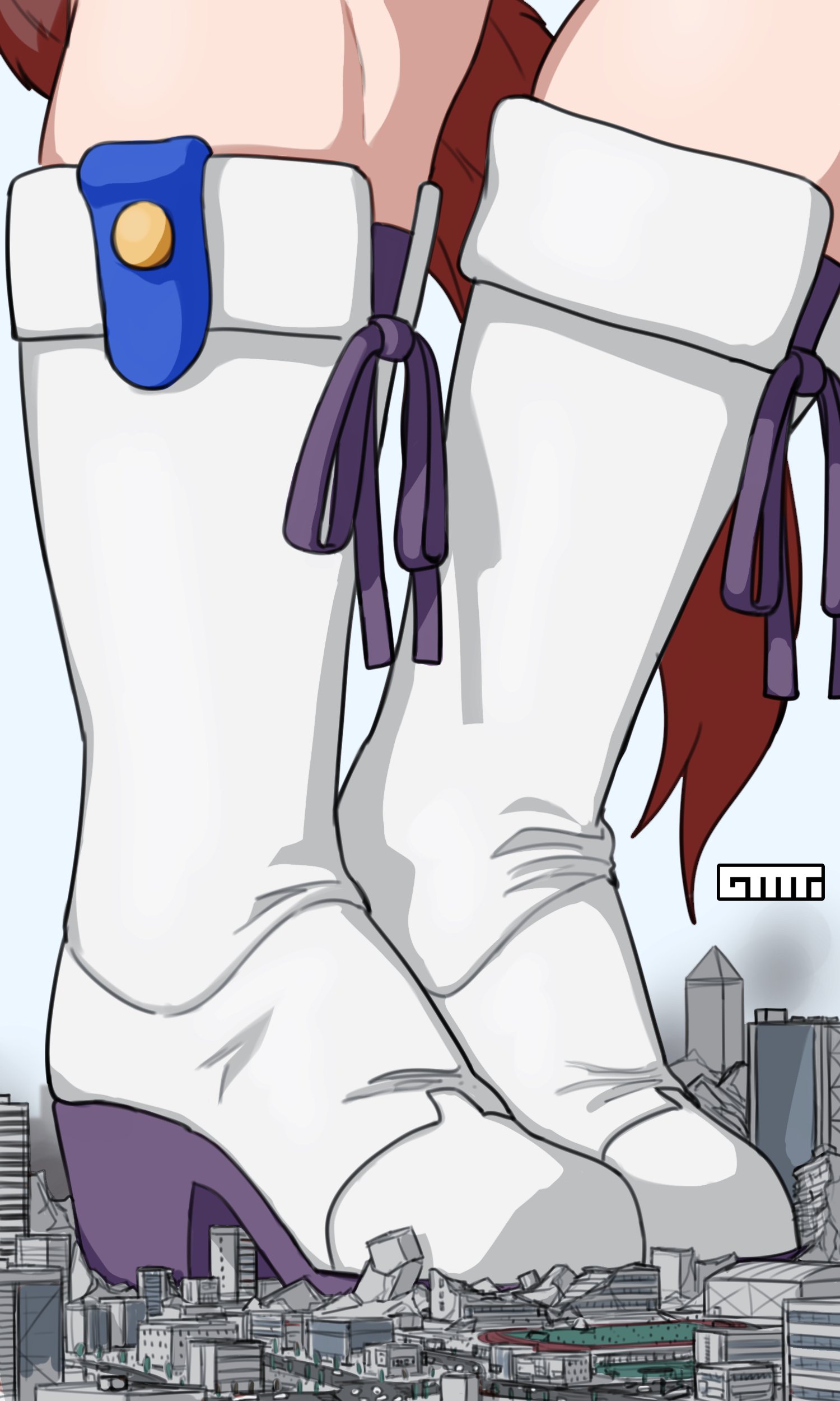
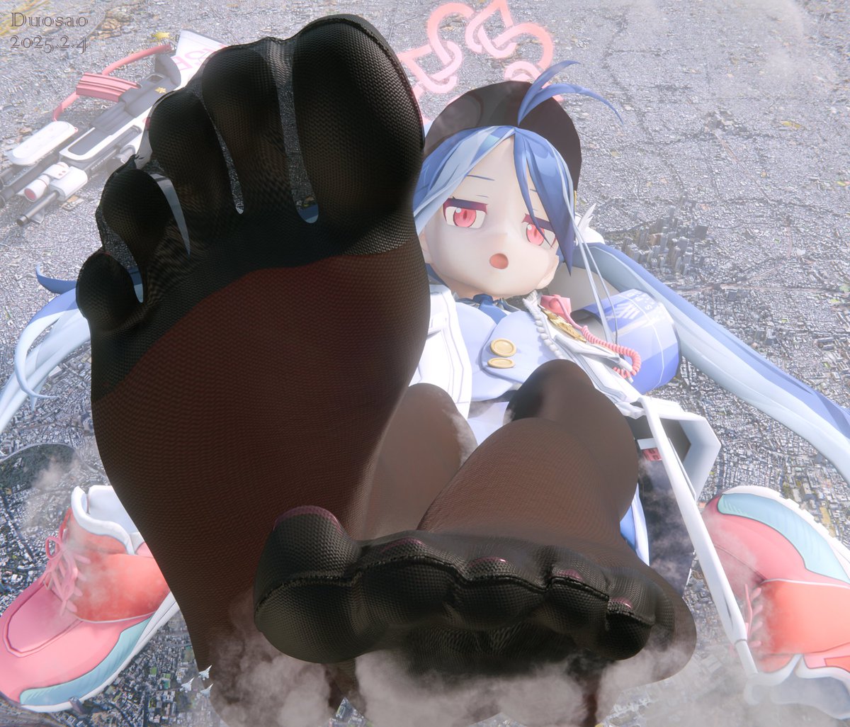
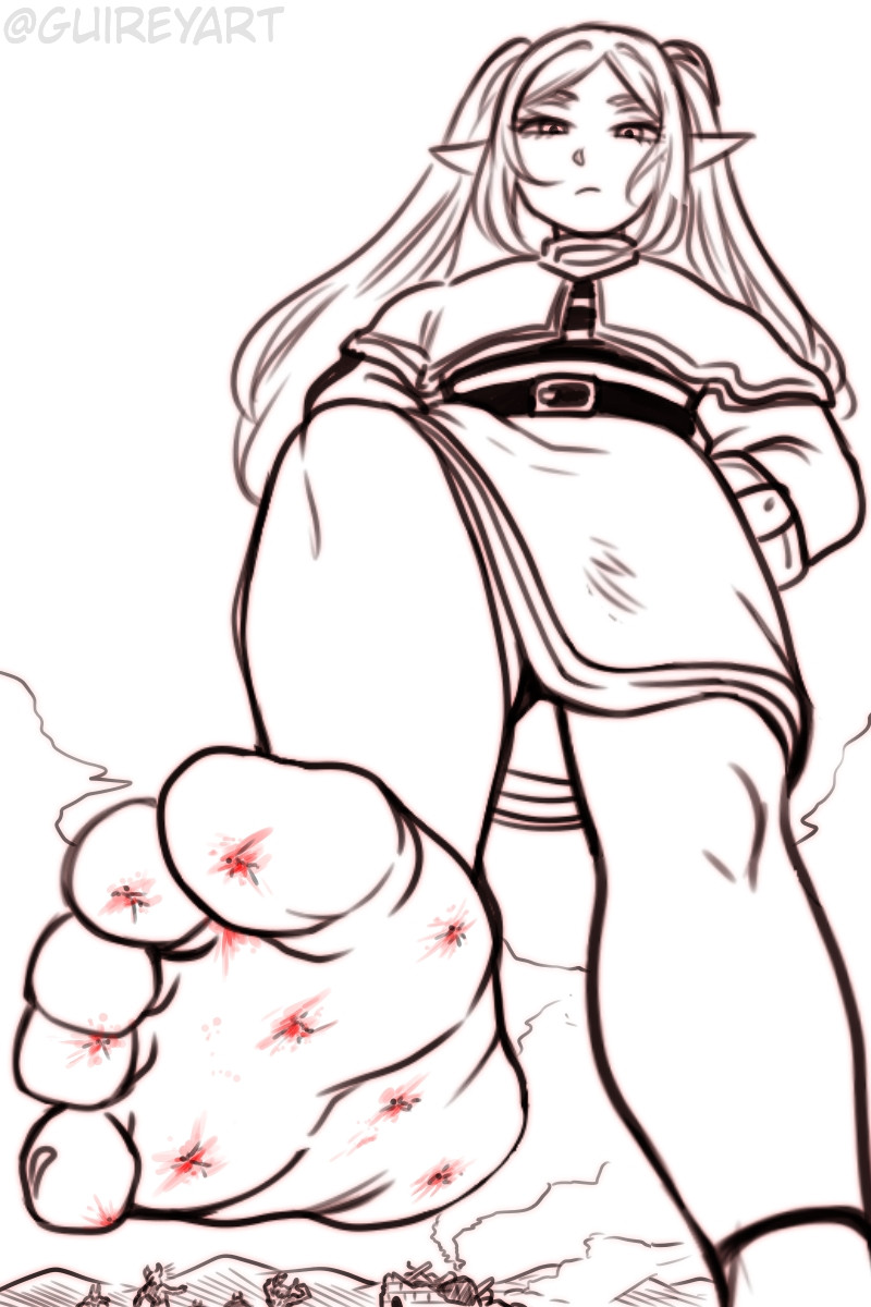
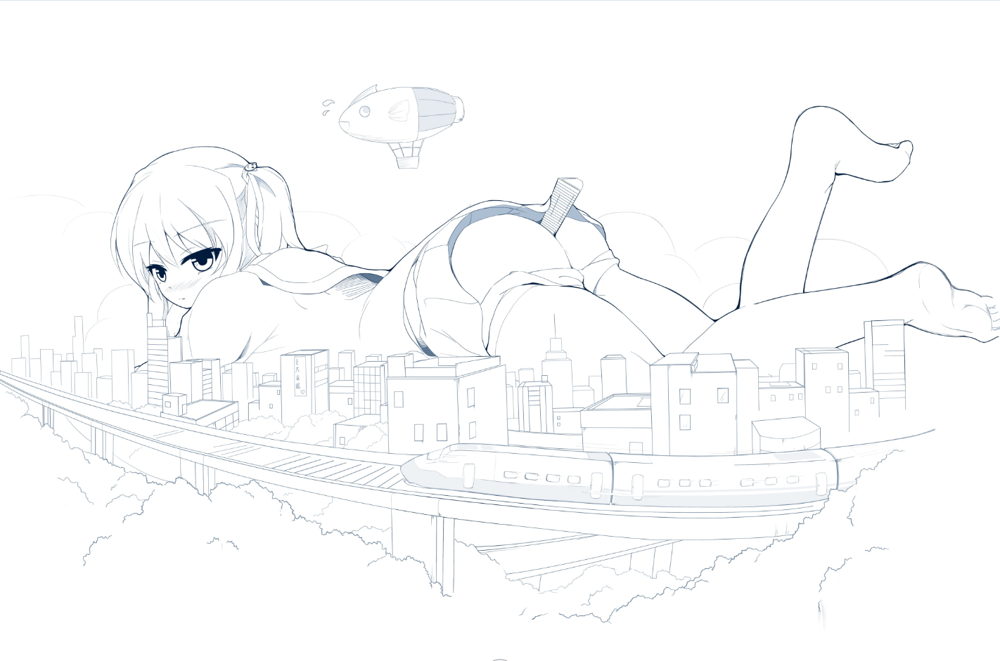
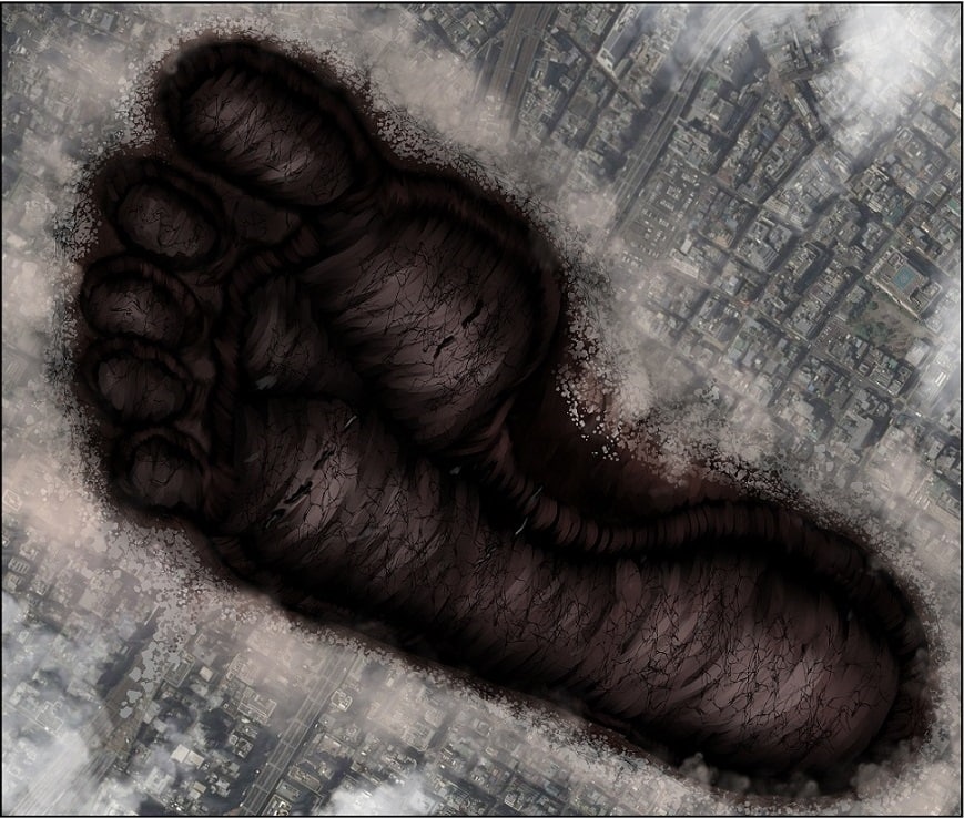
>>11360937
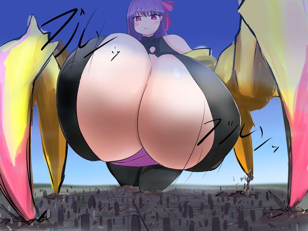
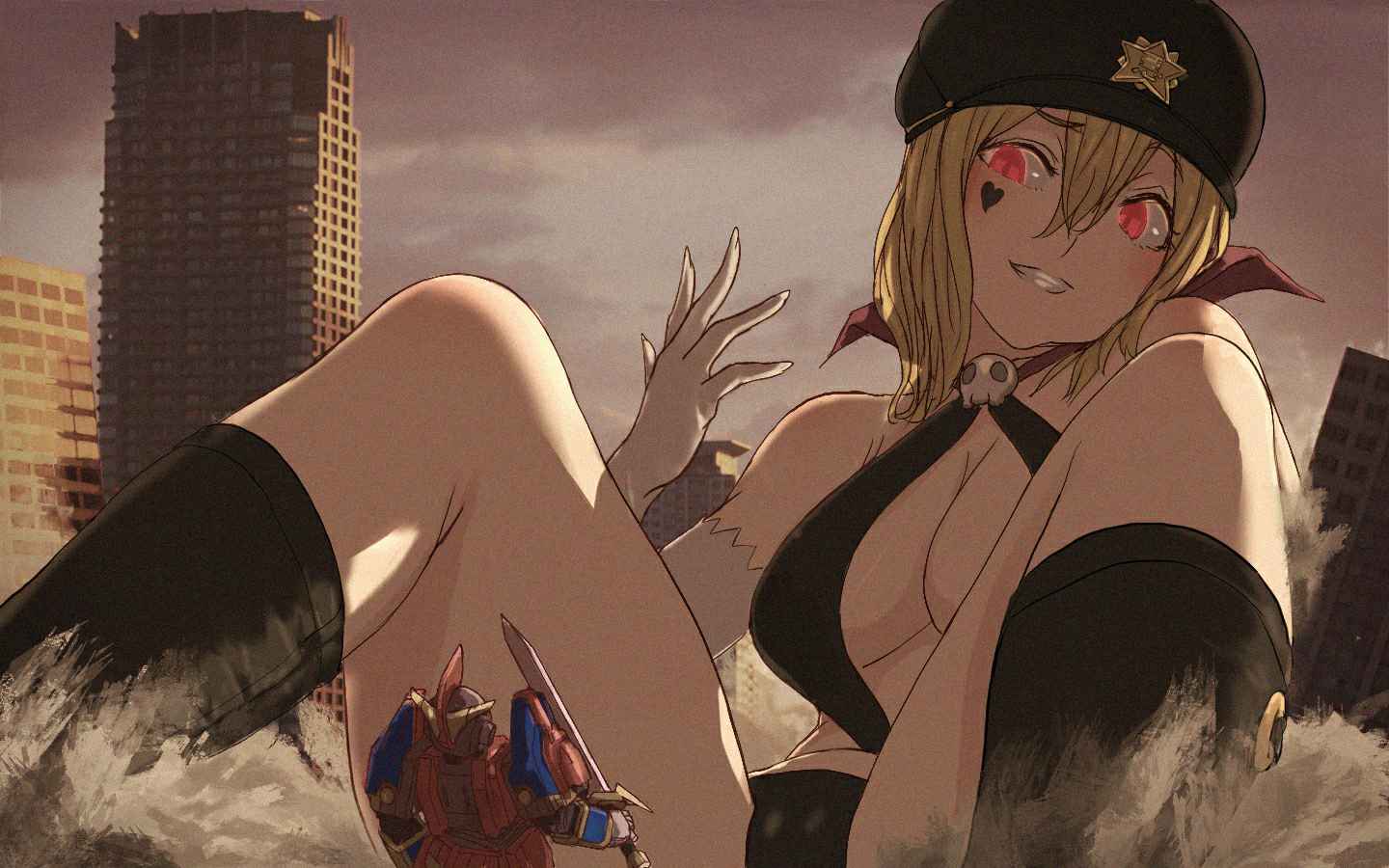
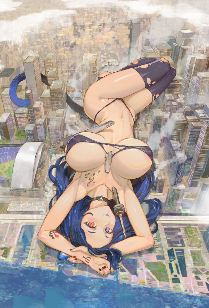
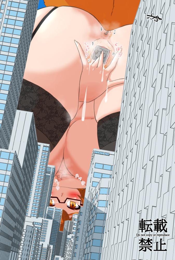
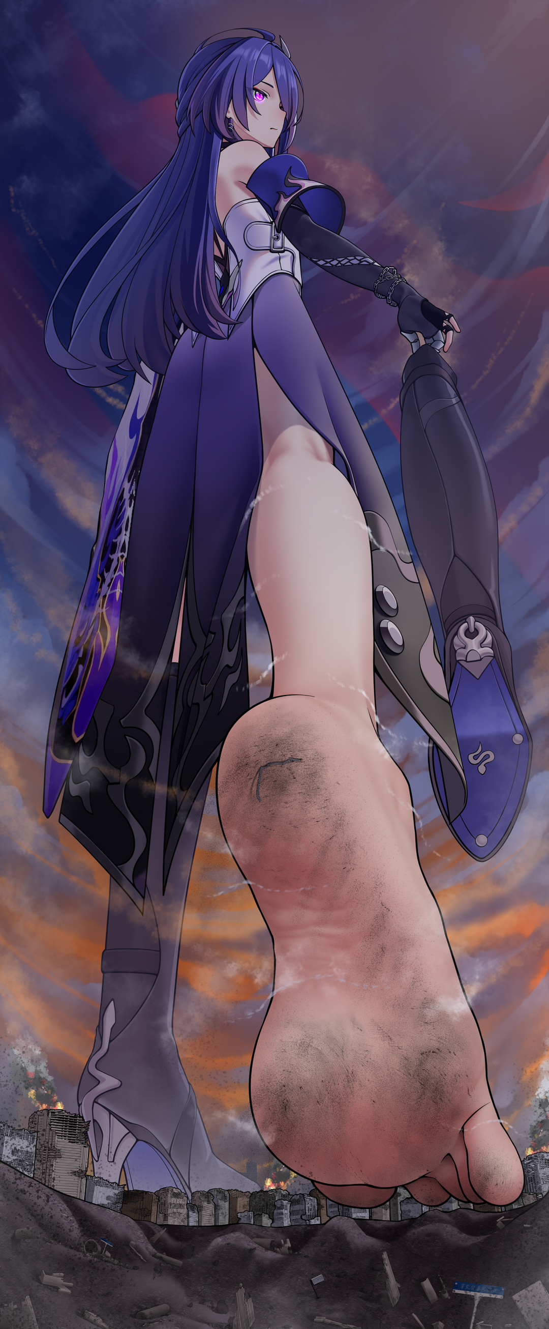
It's much better with regard to the lines, but I would reduce it further, maybe about half that thickness. However, the anatomy seems to have worsened, particularly the glutes in relation to the legs. In other words, the butt shouldn't be thicker than the legs, unless you're doing some kind of inflation picture.
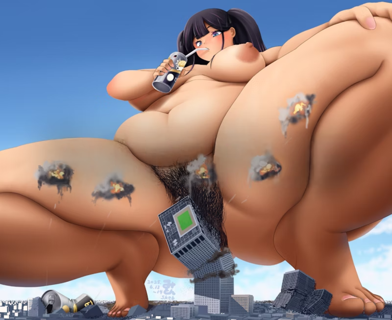
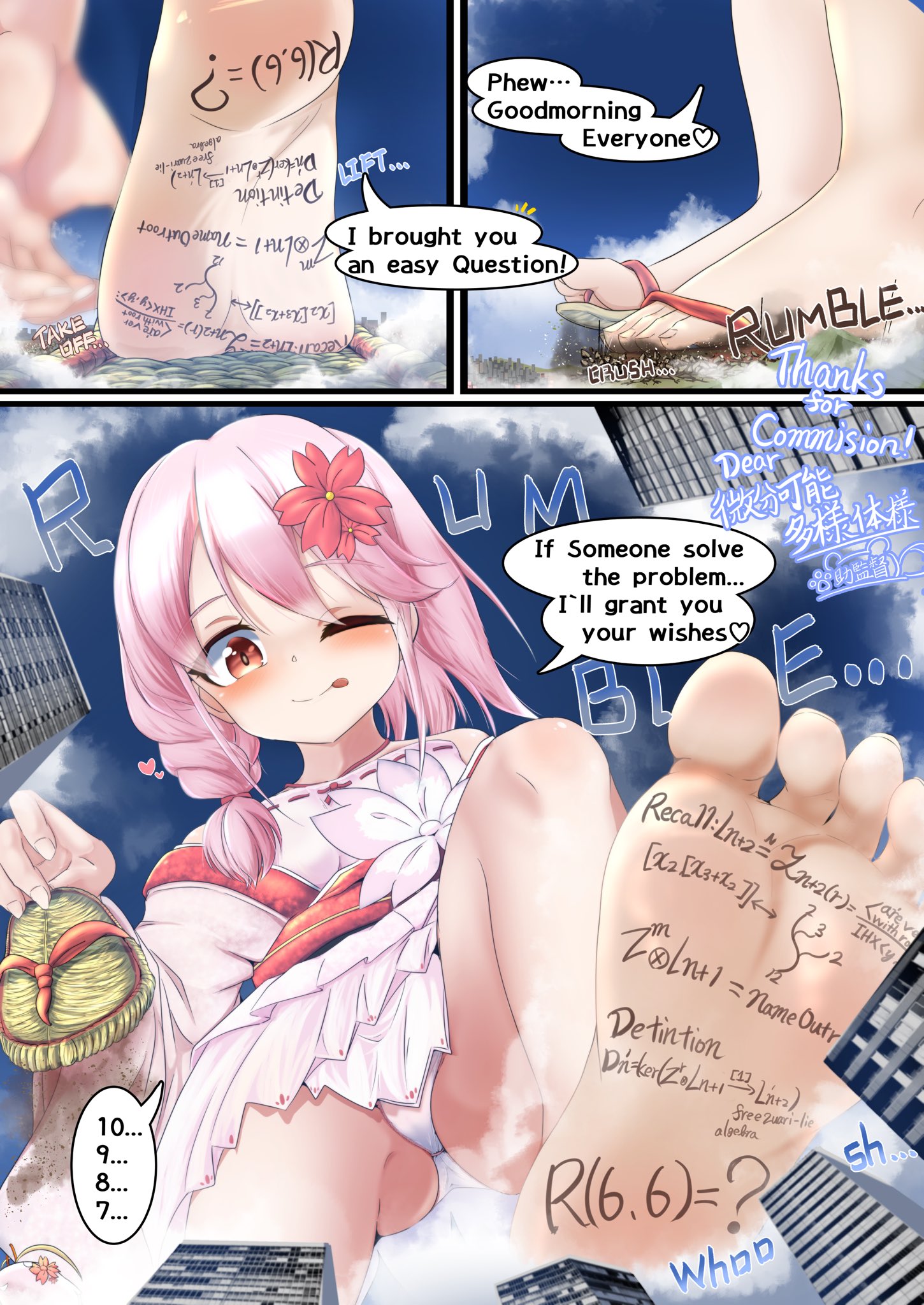
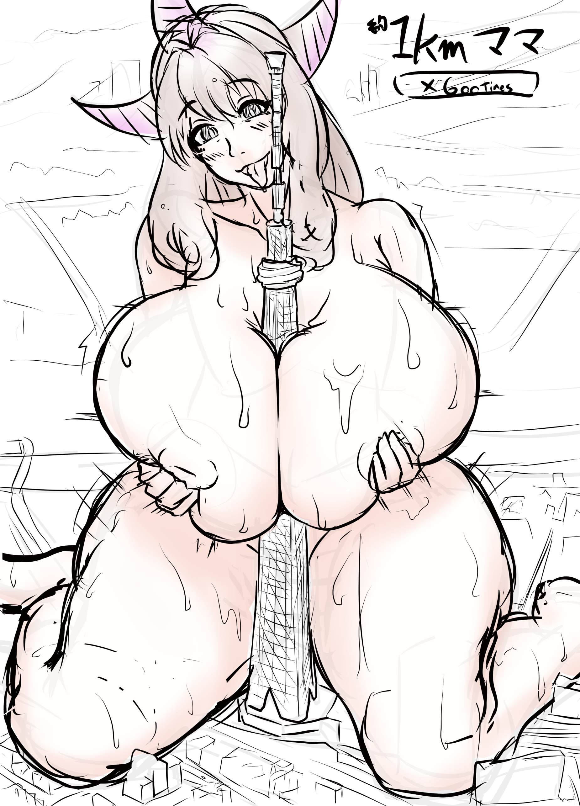
Props for trying a very difficult angle/pose combo, but it does make it hard to gauge your anatomical capability. The buildings are probably too simplified, but I can tell that's not finished yet so I'll let it slide. A tip, though; try doing fewer buildings that are a little wider so that you don't have to draw as many of them, space them out, and cluster them into city blocks.