Anonymous
6/15/2025, 3:26:07 PM
No.105600722
[Report]
>>105600751
>>105600855
>>105600914
>>105600922
>>105600928
>>105600934
>>105600962
>>105600974
>>105600975
>>105600999
>>105601021
>>105601053
>>105601073
>>105601173
>>105601369
>>105602236
>>105602948
>>105603136
>>105603173
>>105603315
>>105603355
>>105603403
>>105604825
>>105606056
>>105606171
>>105606359
>>105606465
>>105606925
>>105606931
>>105606941
>>105606961
>>105606977
>>105607160
>>105607353
>>105607513
>>105607560
>>105607933
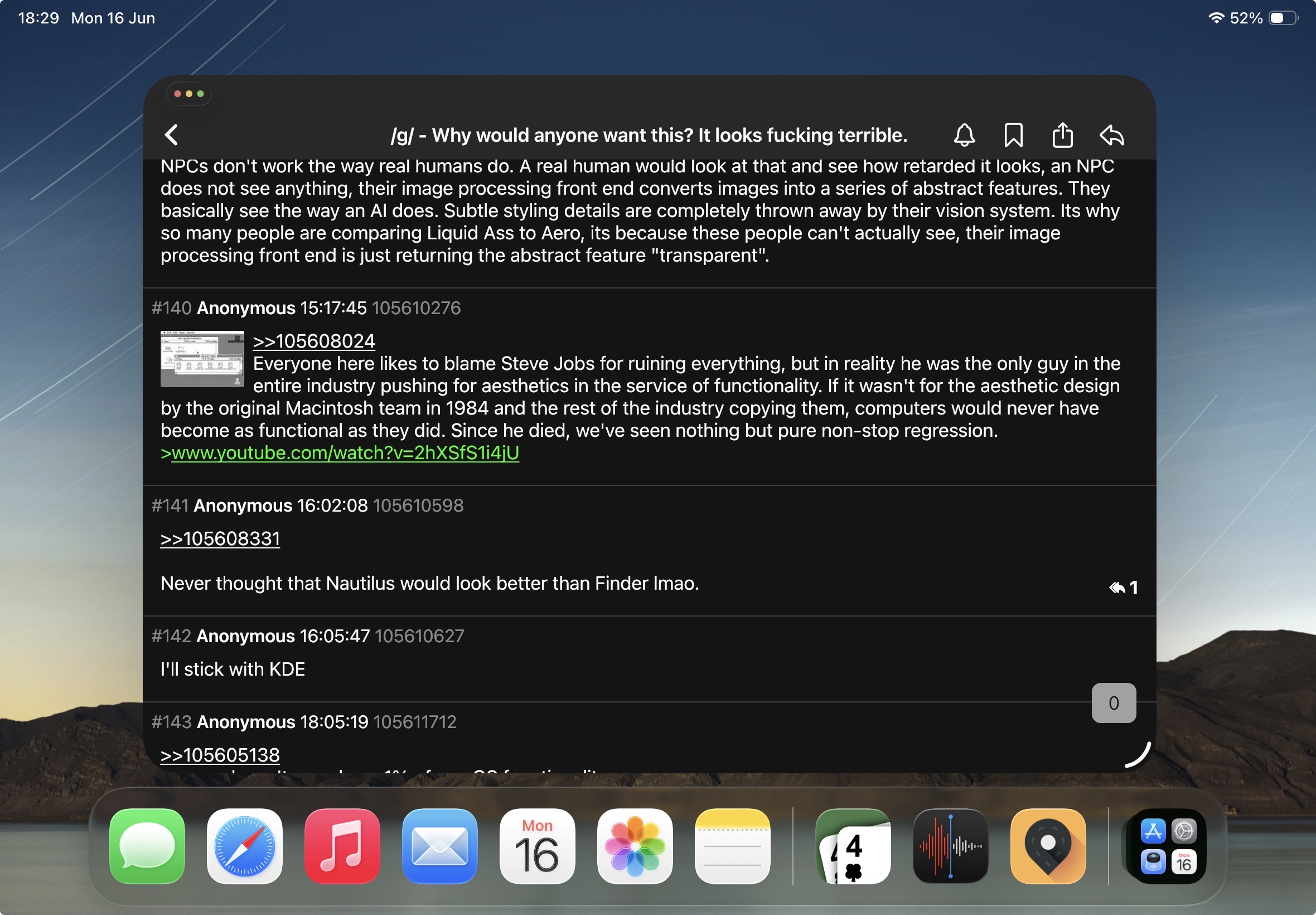
>>105608331
>>105610207
>>105612741
>>105613927
>>105615050
>>105615197
>>105615359
>>105616054
>>105616077
>>105616432
>>105618075
>>105622140
>>105622145
>>105622177
>>105622187
>>105626328
Why would anyone want this? It looks fucking terrible.