Below is a link to the Google Slides with the chart. Copy it and you can edit the text/colors/categories/etc. So if you disagree with the chart, then change it to something you do agree with. I'm looking forward to seeing better charts giving unique perspectives on MLP's quality! :)
https://docs.google.com/presentation/d/1enJV-XTQyKqMGsBnh-MXmE19RQAgoatb4c4yh_Lx2W4/edit?usp=sharing
4chan Search
4 results for "3a4cd31142e7bae5b66e581a1a99f90c"
CHALLENGE: Make A Better Version of This Chart
Moment of Truth POLL: Is the MLP Quality Chart Correct?
>>42259815
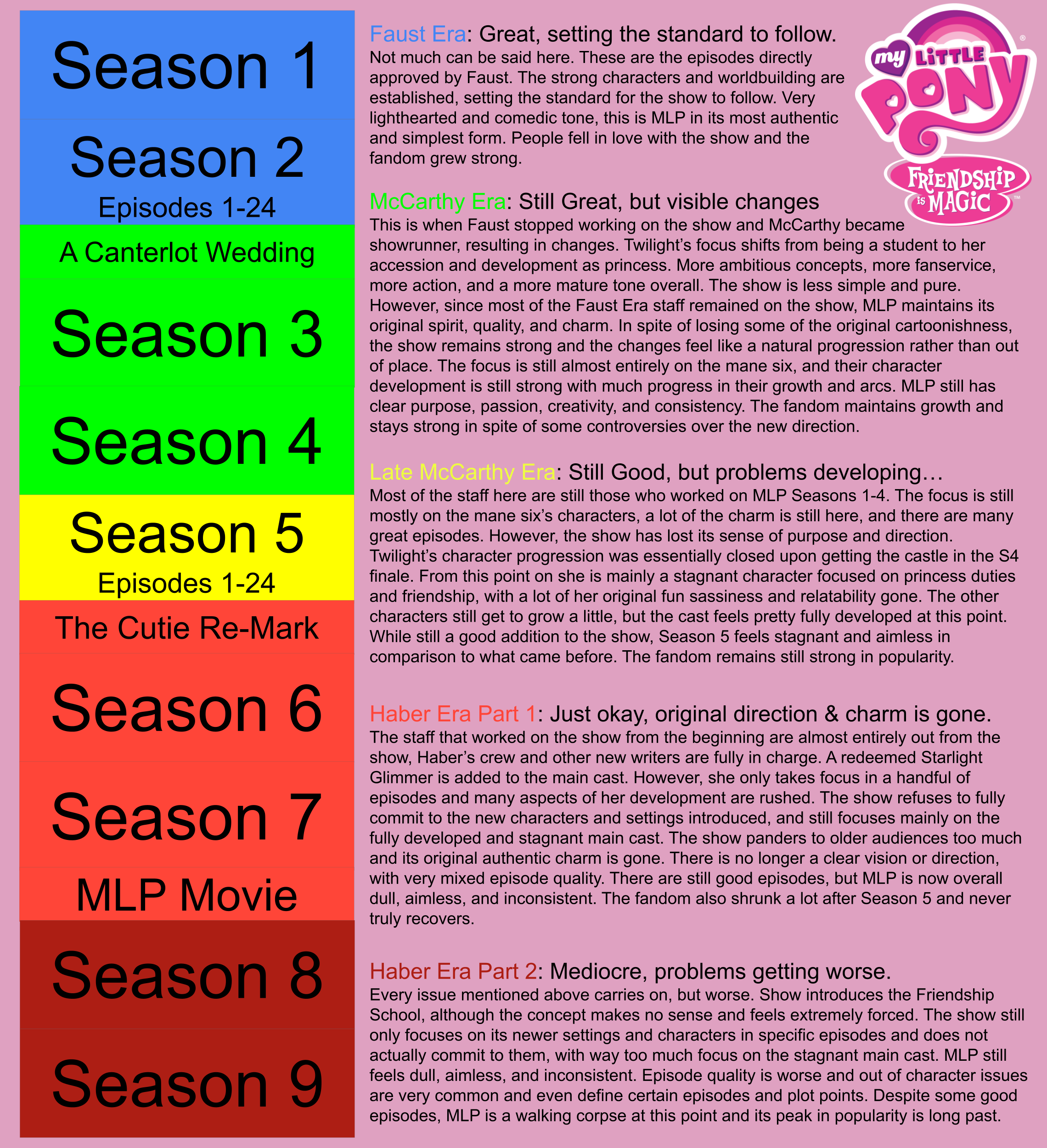
The brony fandom is very split on most of the seasons. Personally I believe seasons 1-5 was the golden era, as explained in this chart. Hopefully you'll enjoy the whole show tho!
The brony fandom is very split on most of the seasons. Personally I believe seasons 1-5 was the golden era, as explained in this chart. Hopefully you'll enjoy the whole show tho!
>>42246819
A Canterlot Wedding is when faust left and McCarthy left. So obviously it feels very disconnected because Faust stopped overseering the production early on and it went onto McCarthy.
A Canterlot Wedding is when faust left and McCarthy left. So obviously it feels very disconnected because Faust stopped overseering the production early on and it went onto McCarthy.